Posts in Color Series
Finally Get Your Color Type! 3 Tricks Color Analysts DON'T Tell You
 

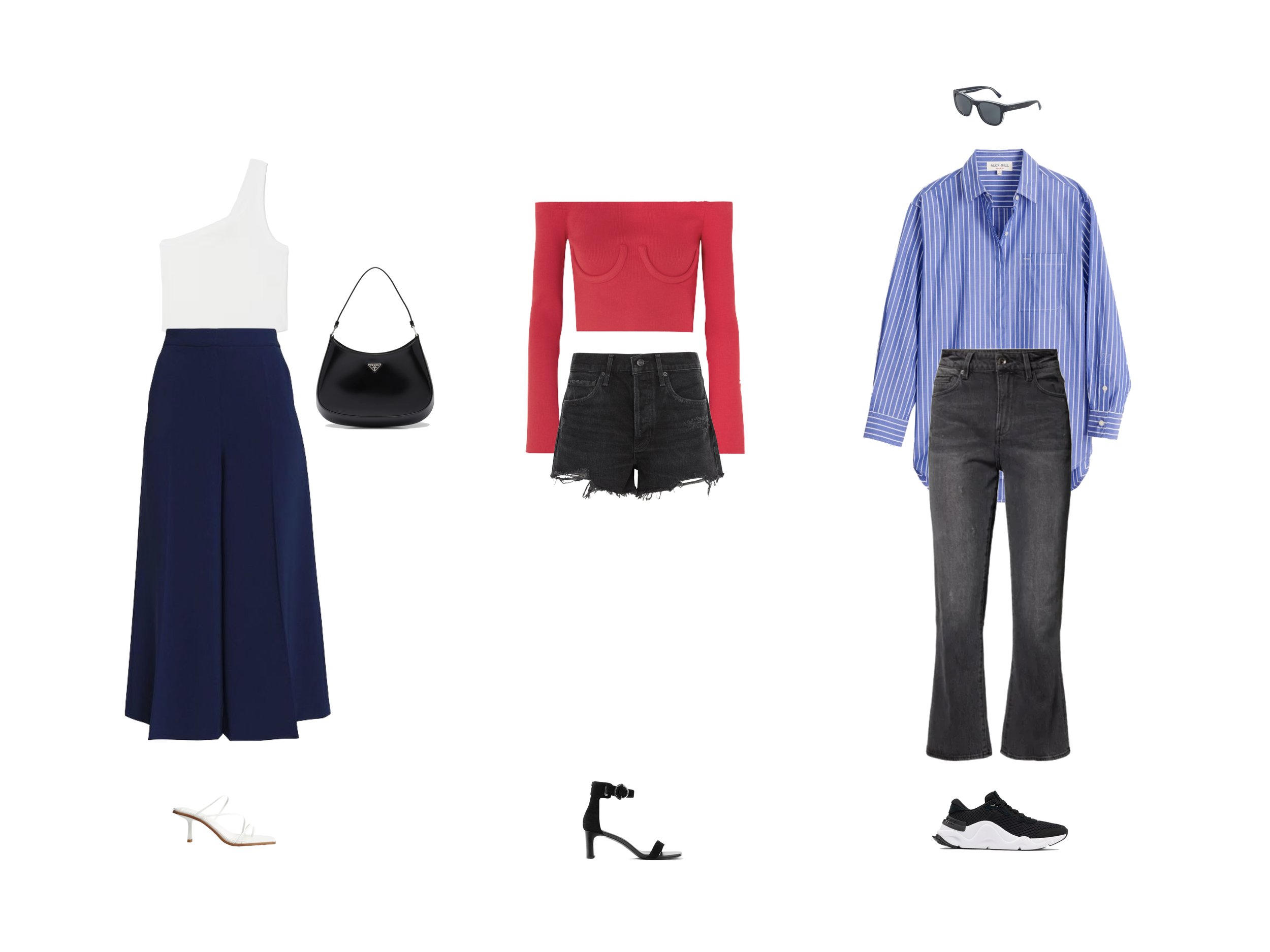
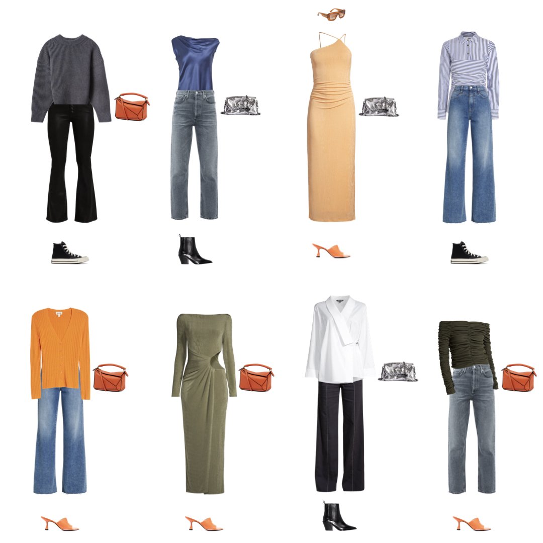
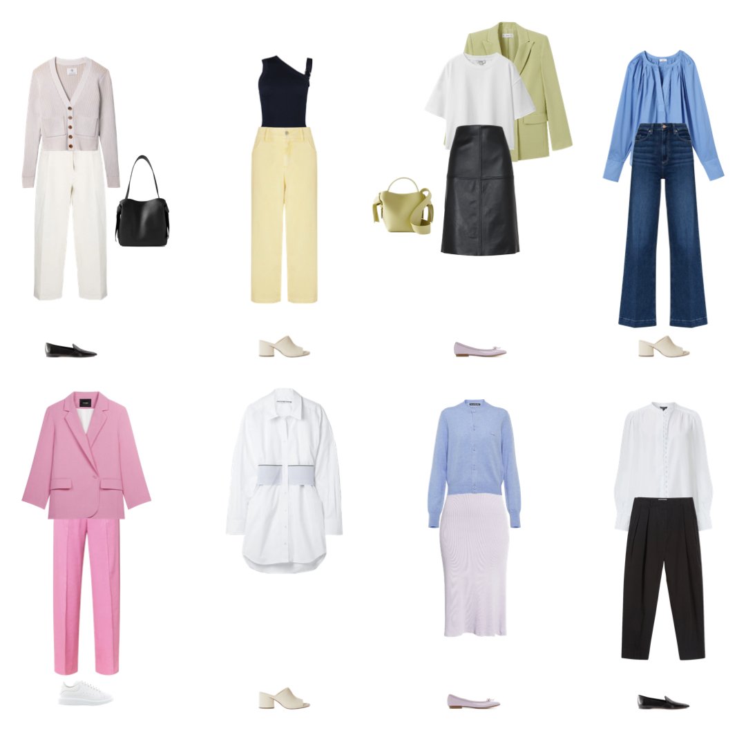
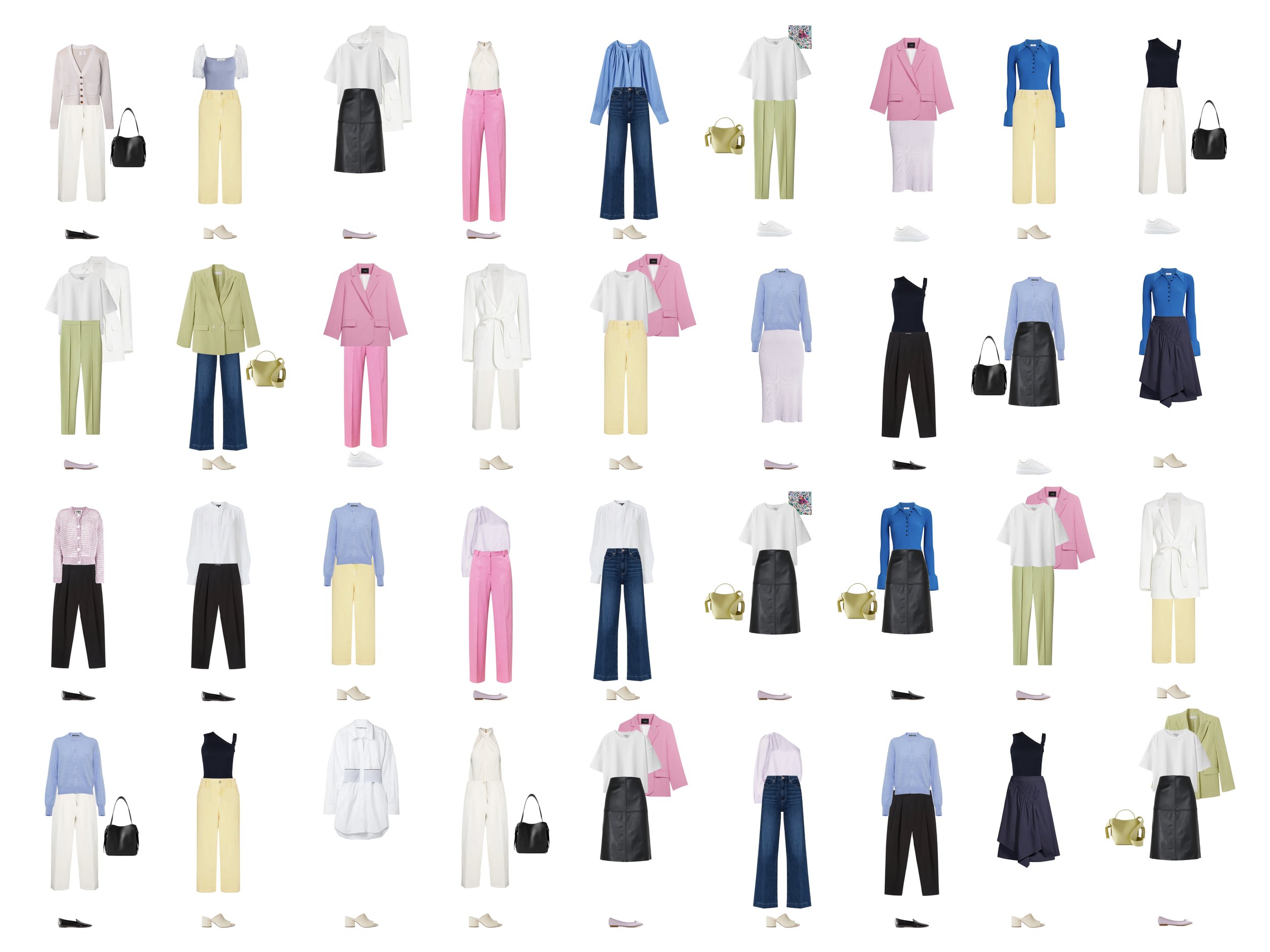
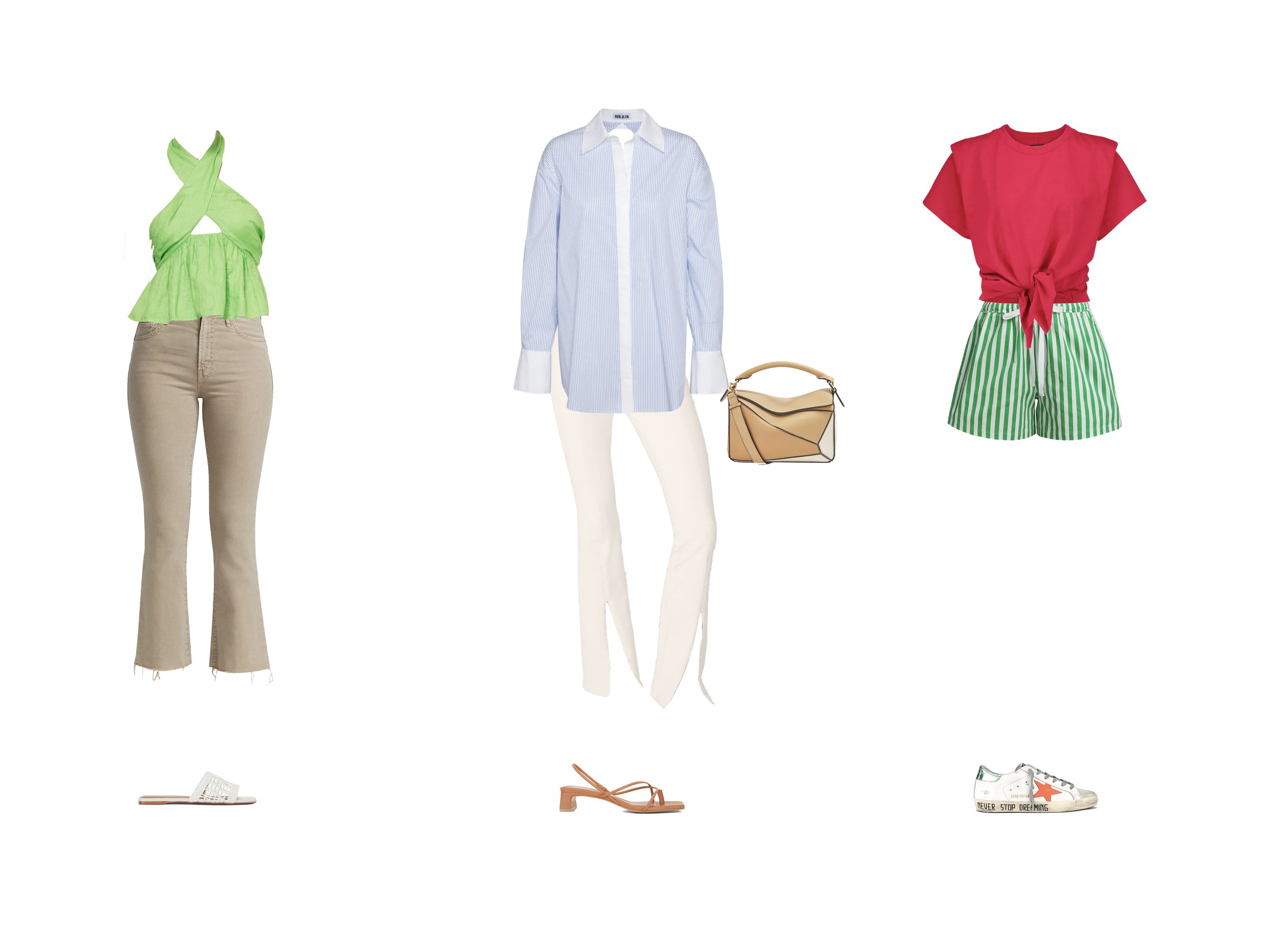
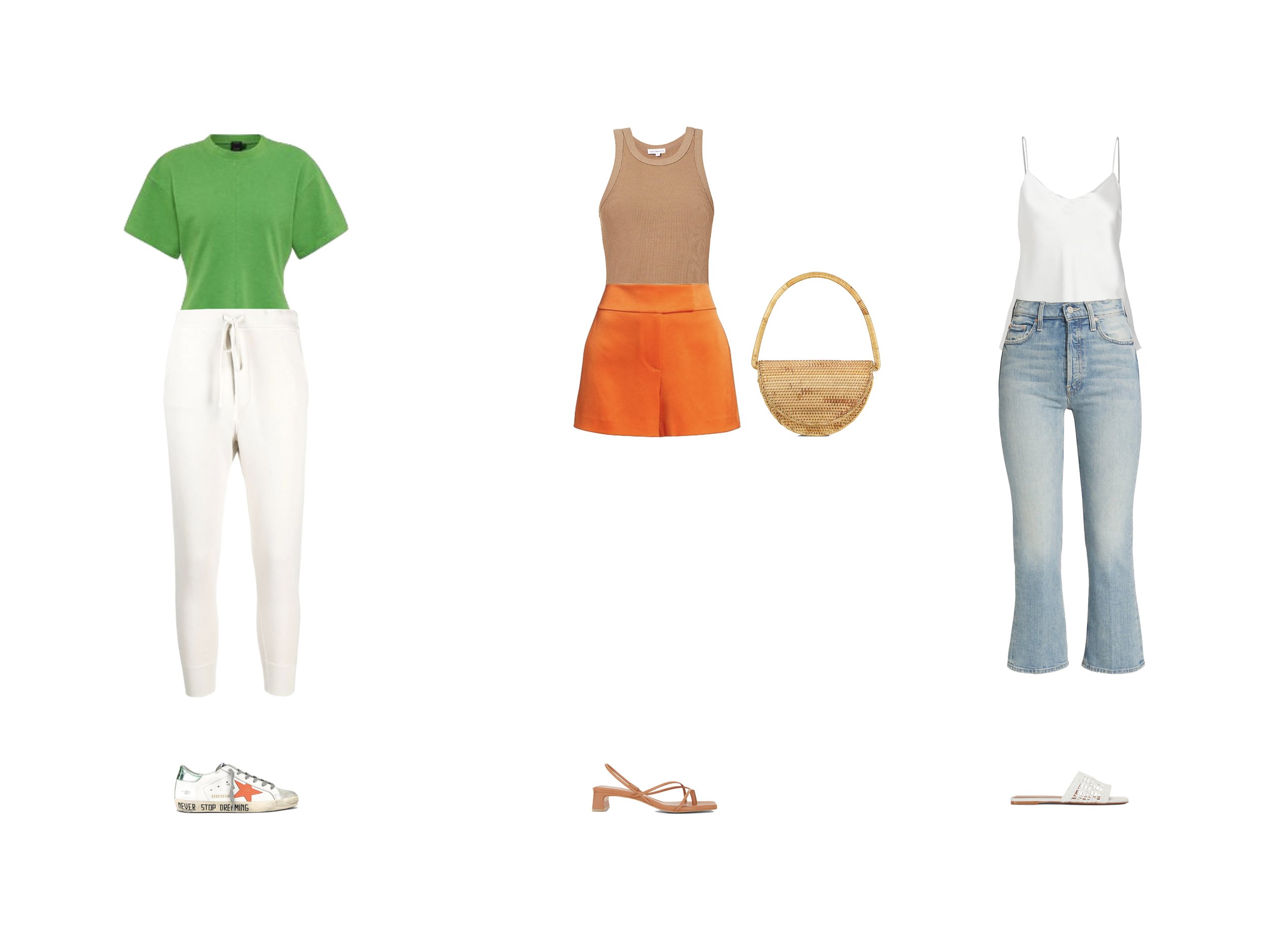
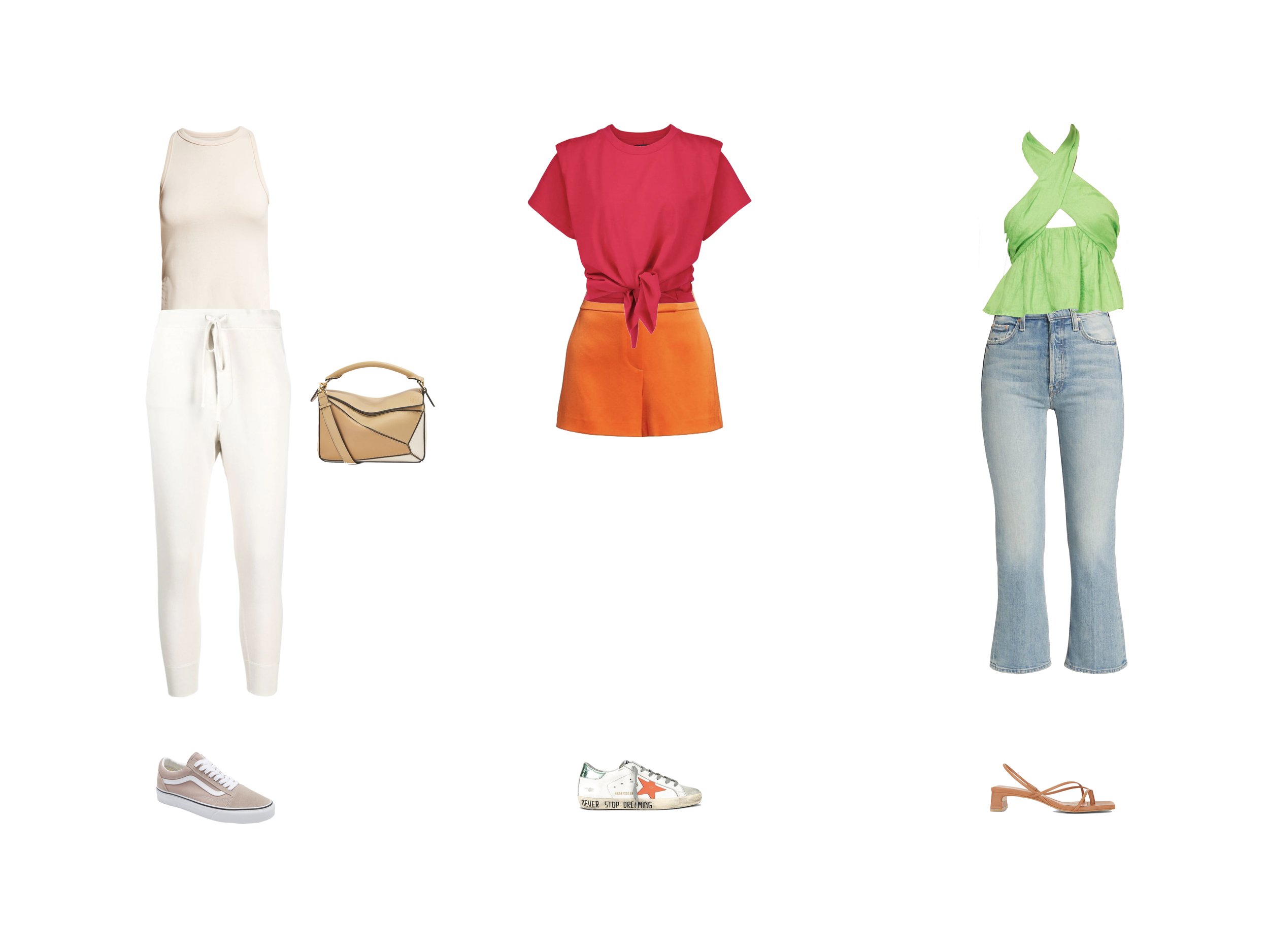
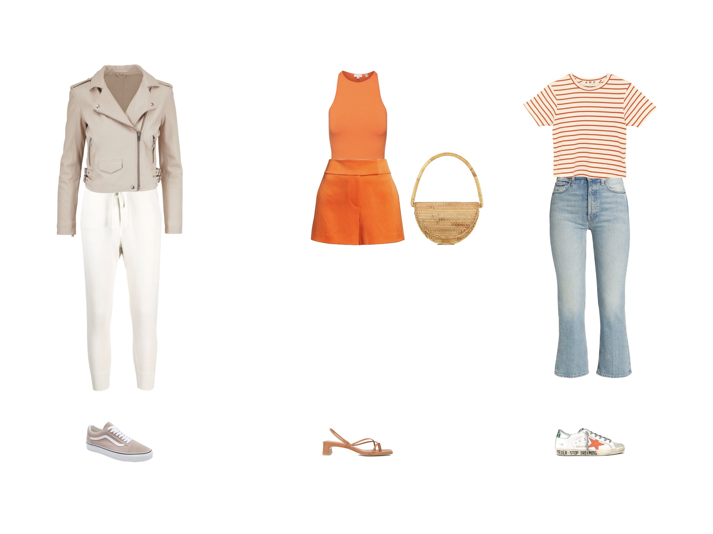
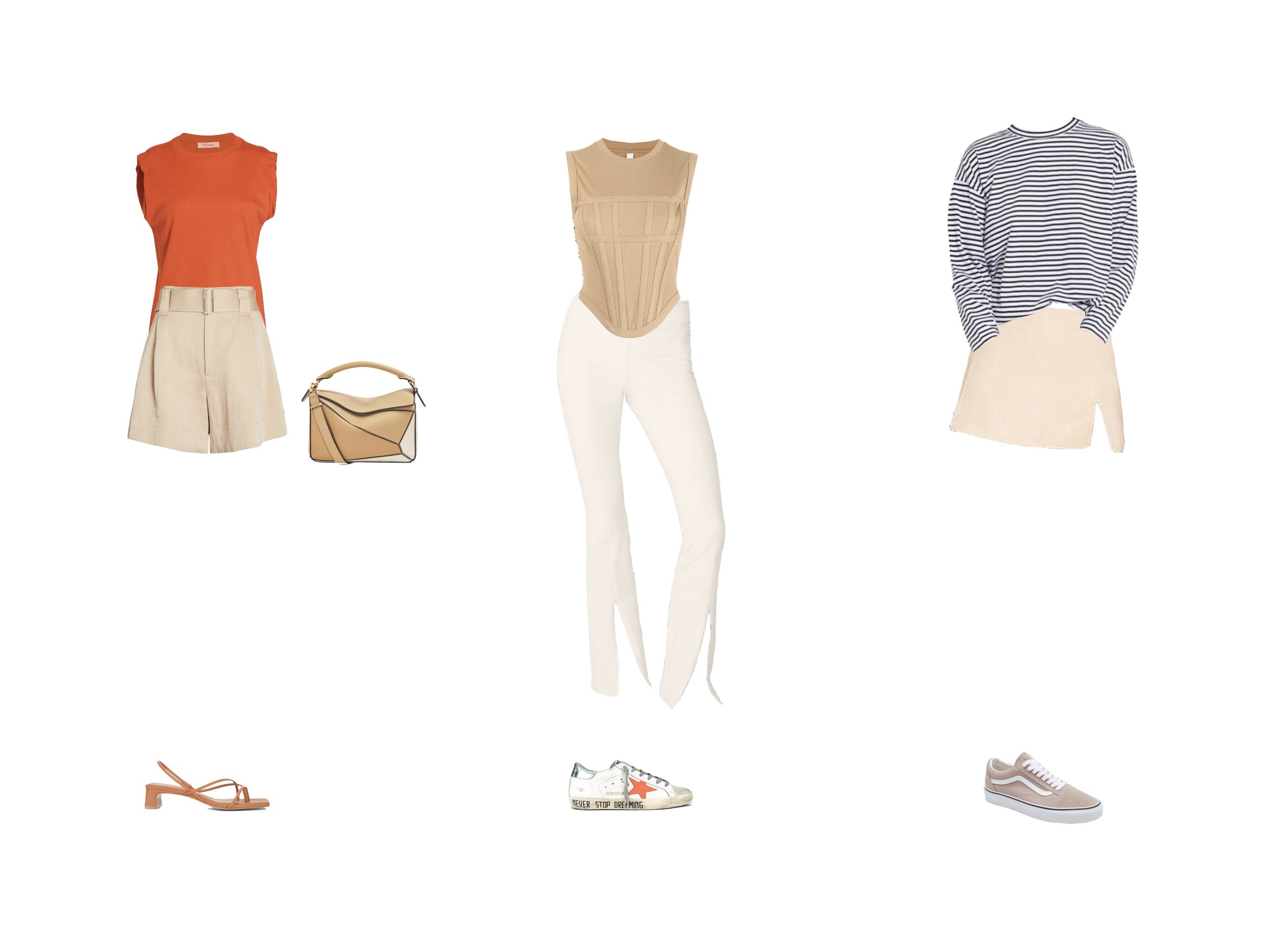
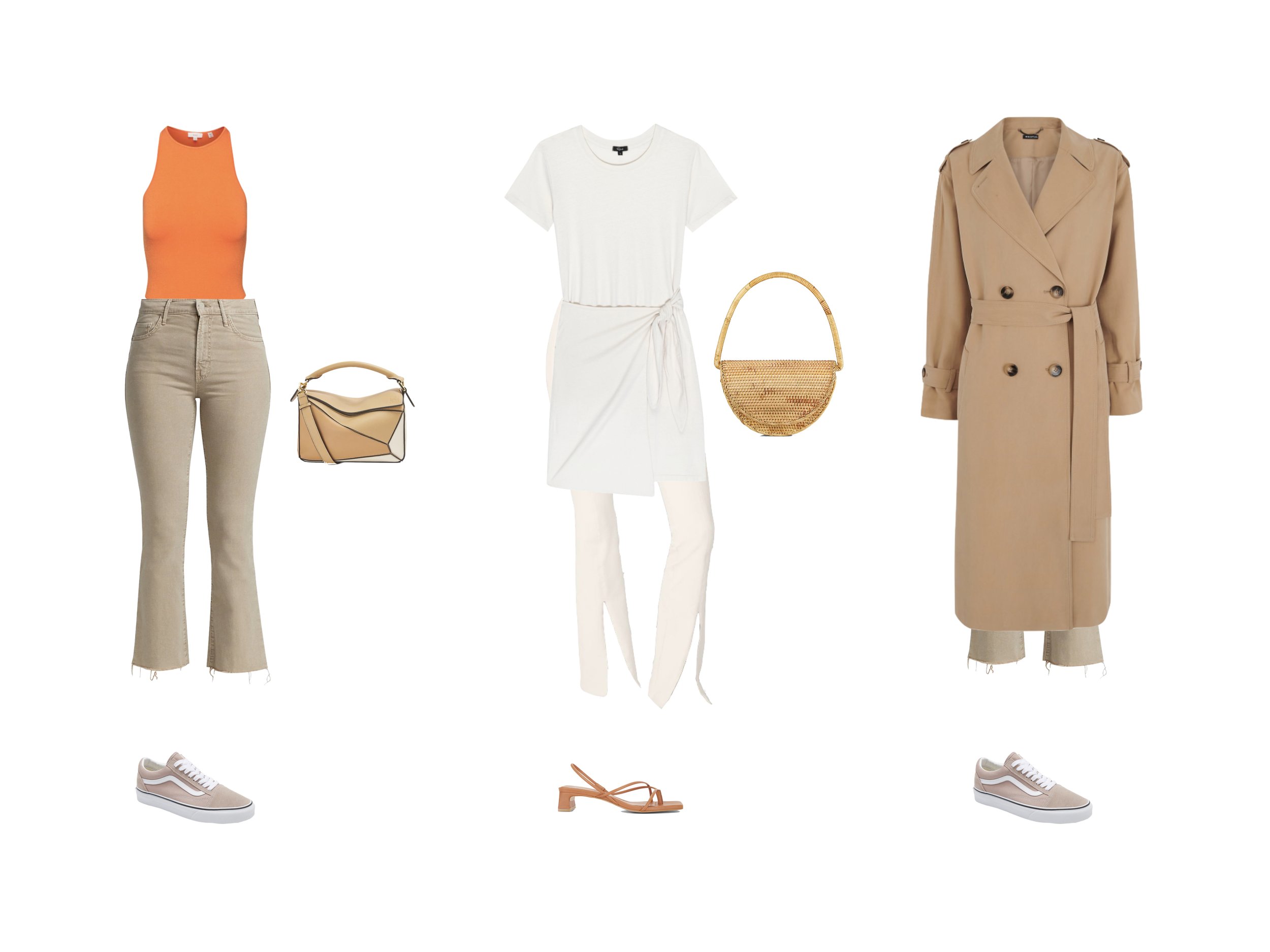
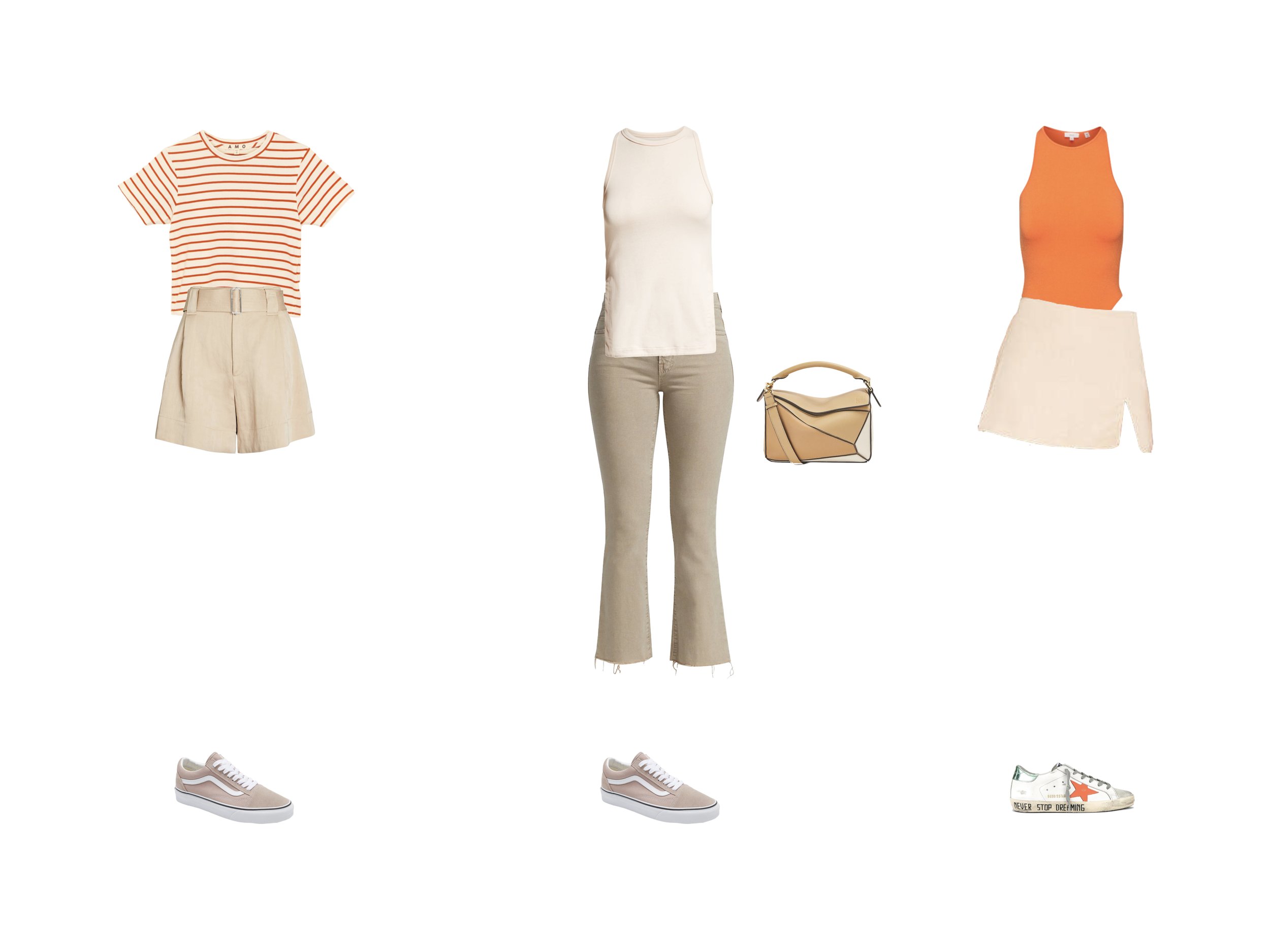
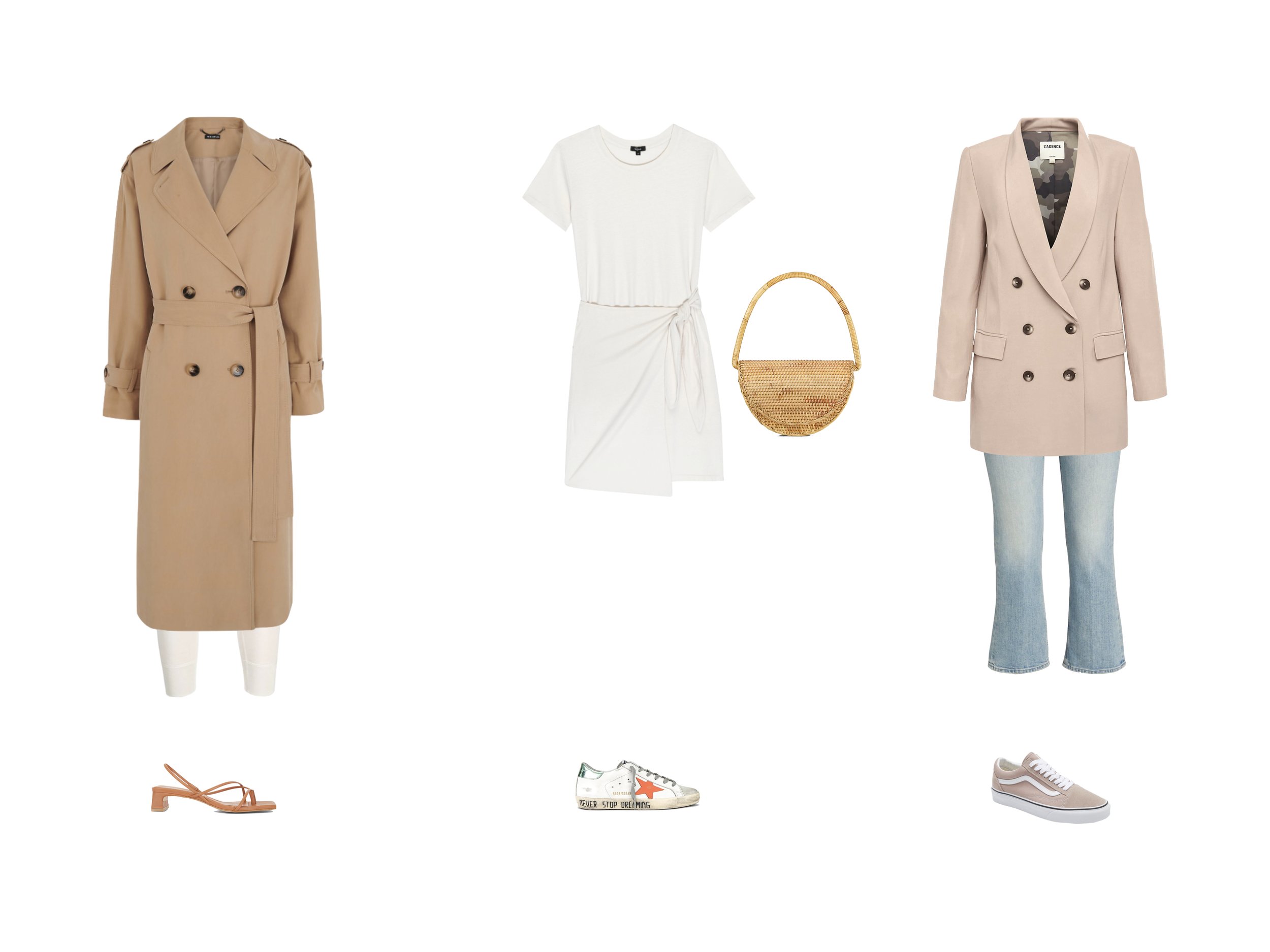
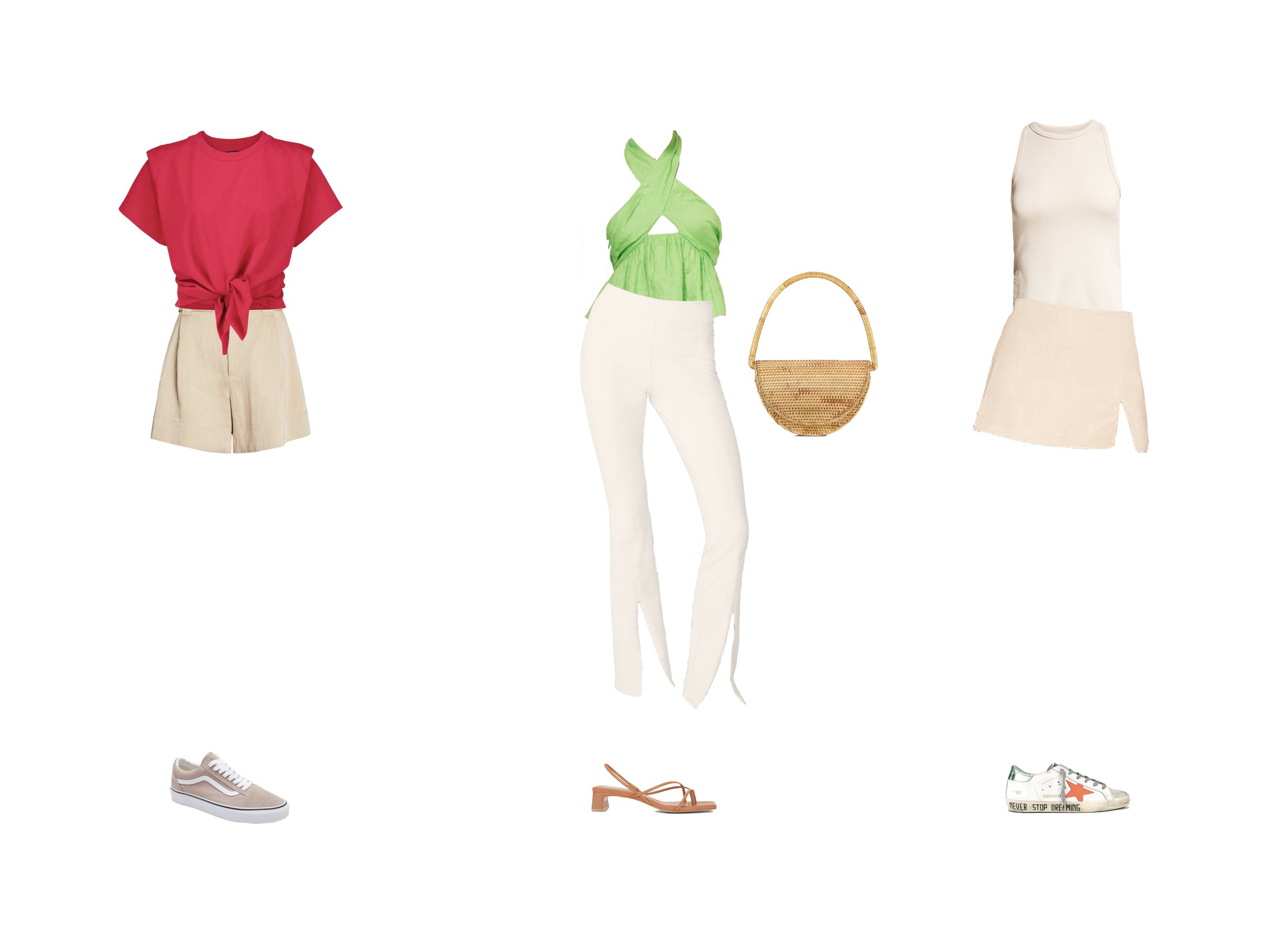
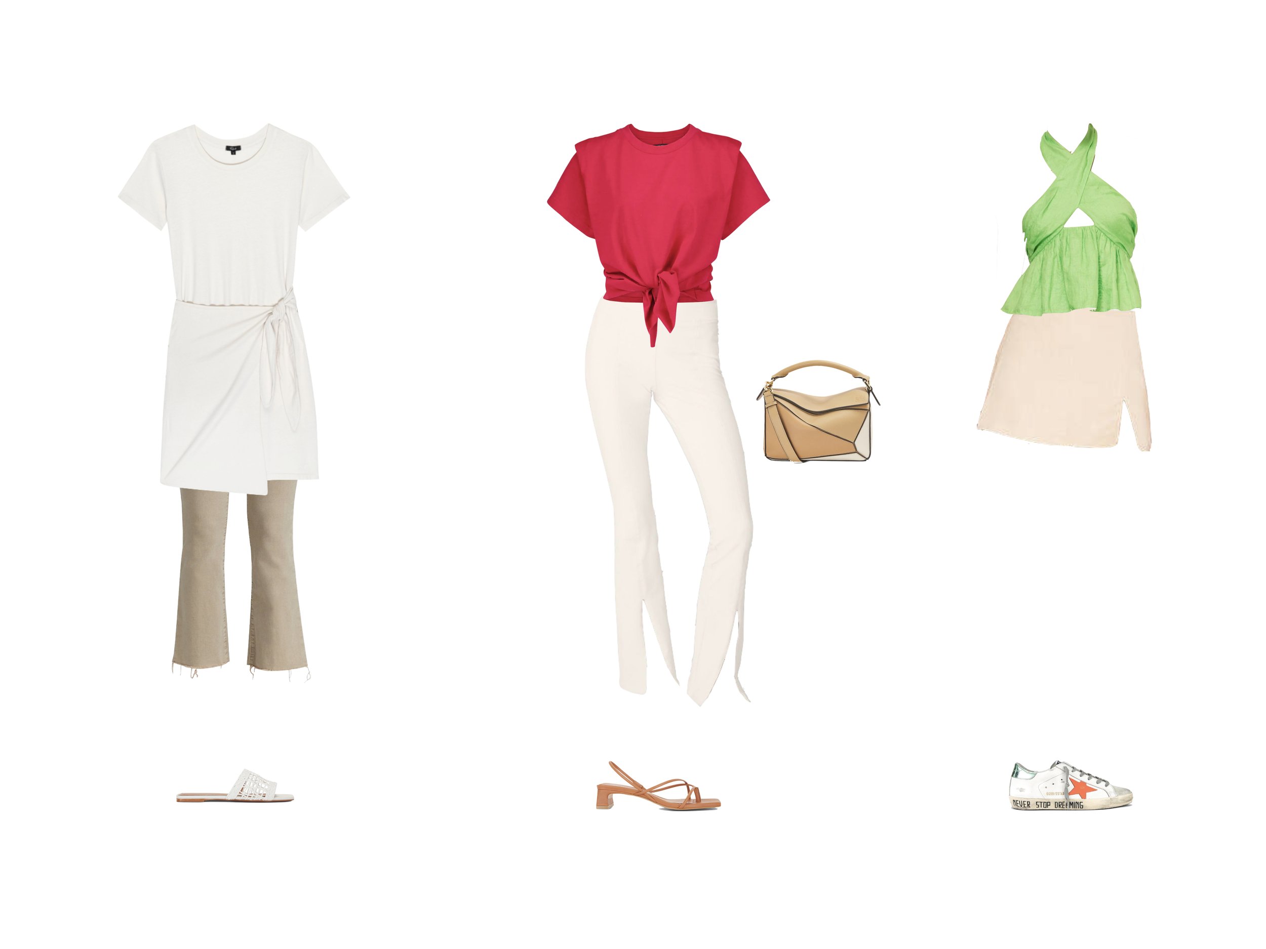
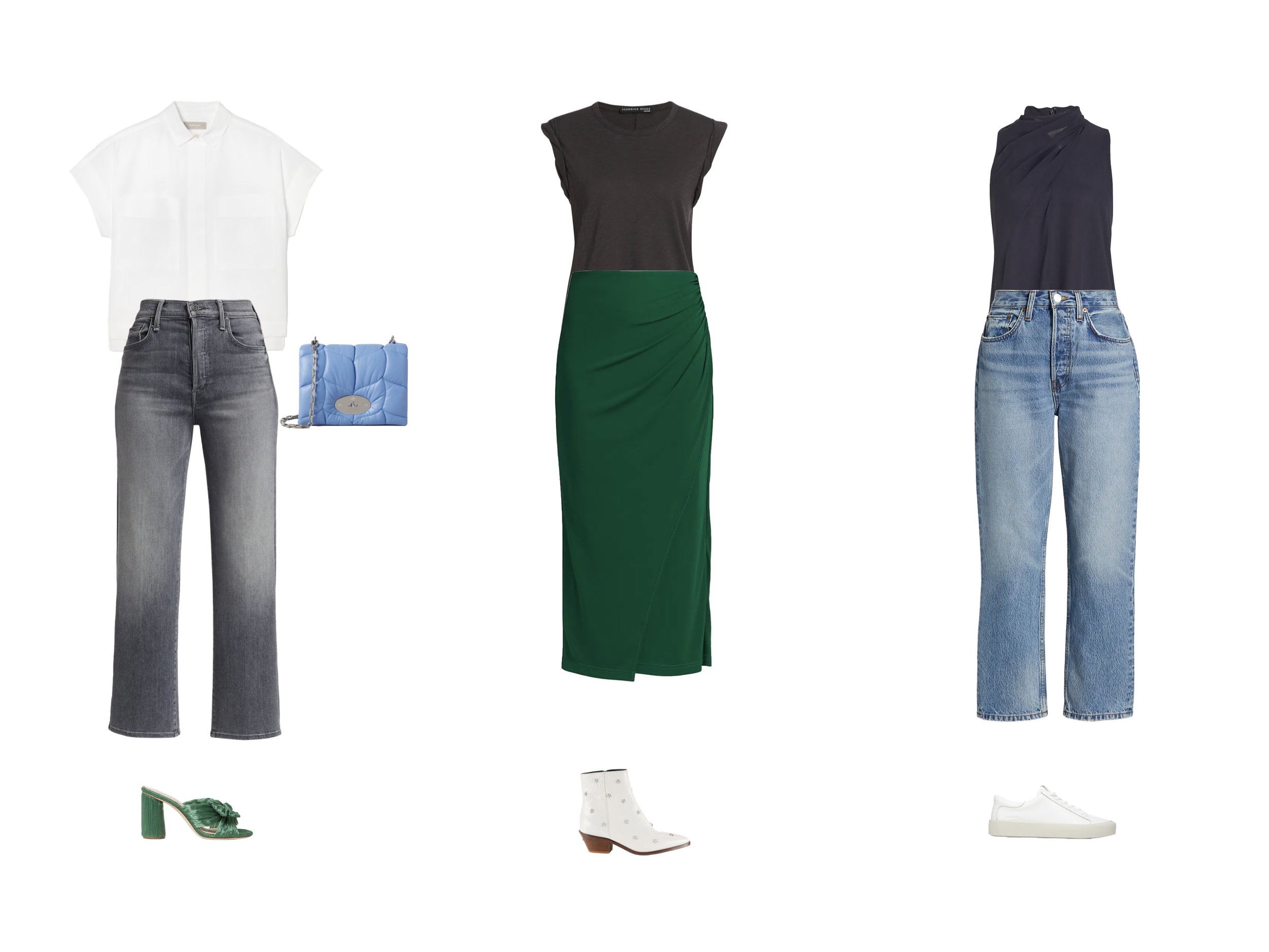
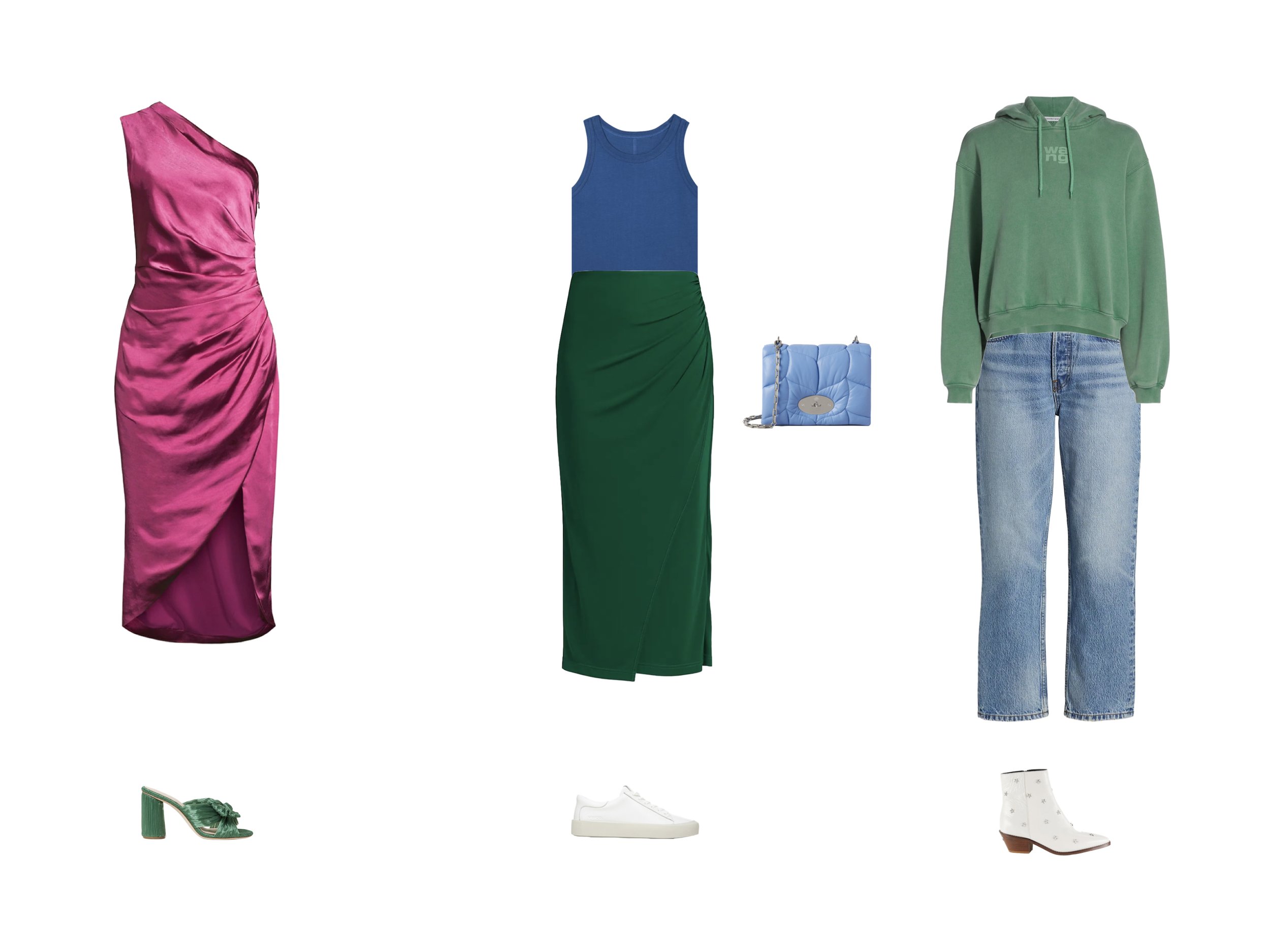
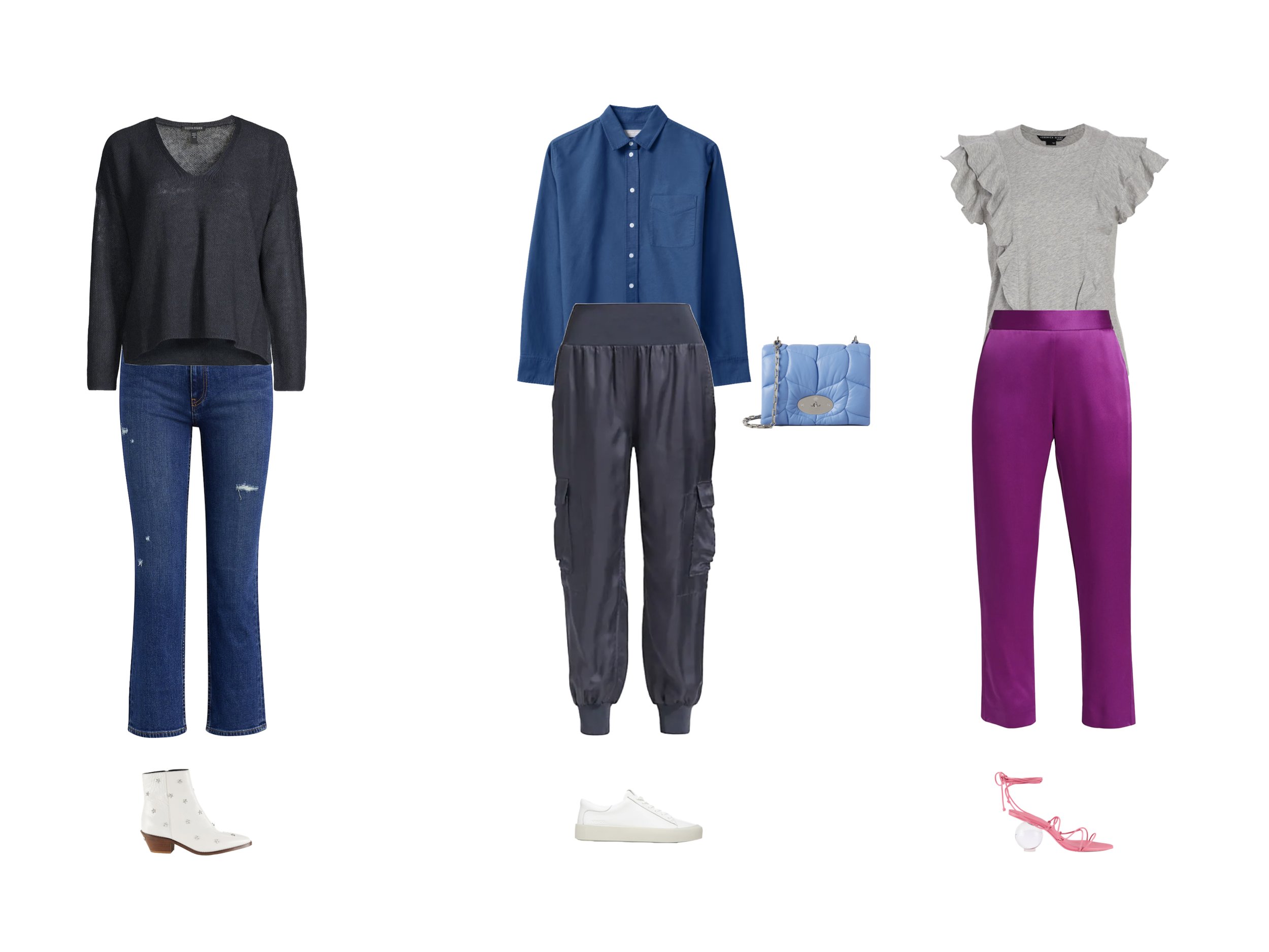
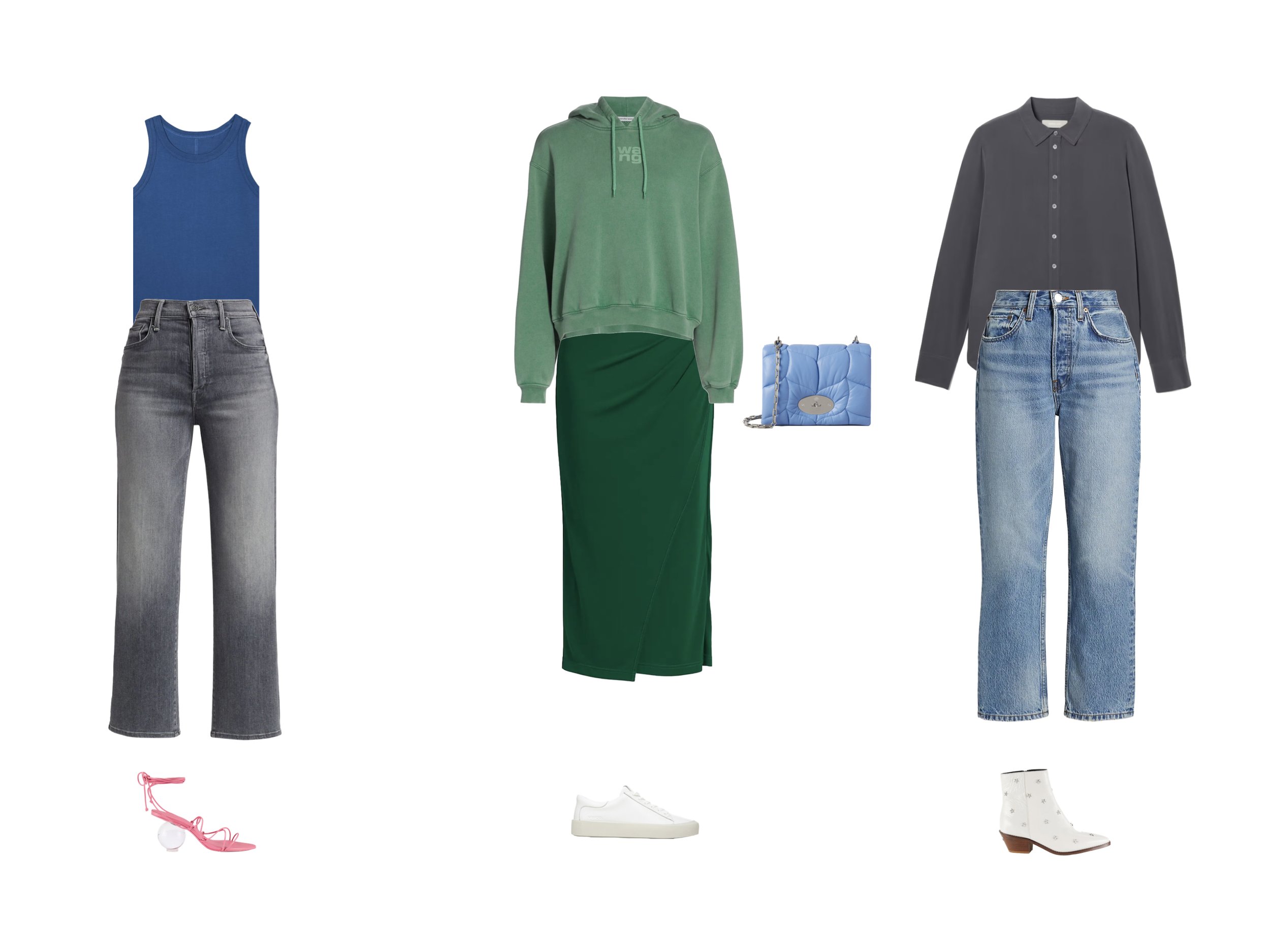
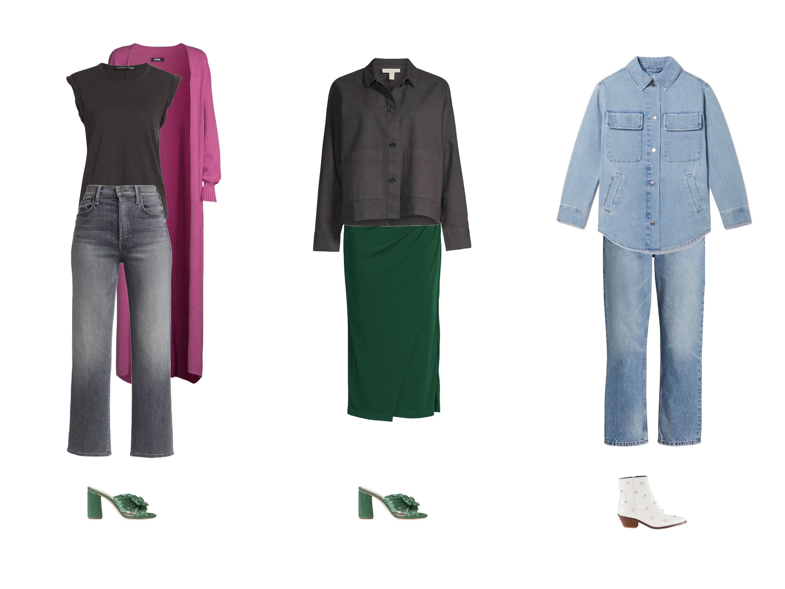
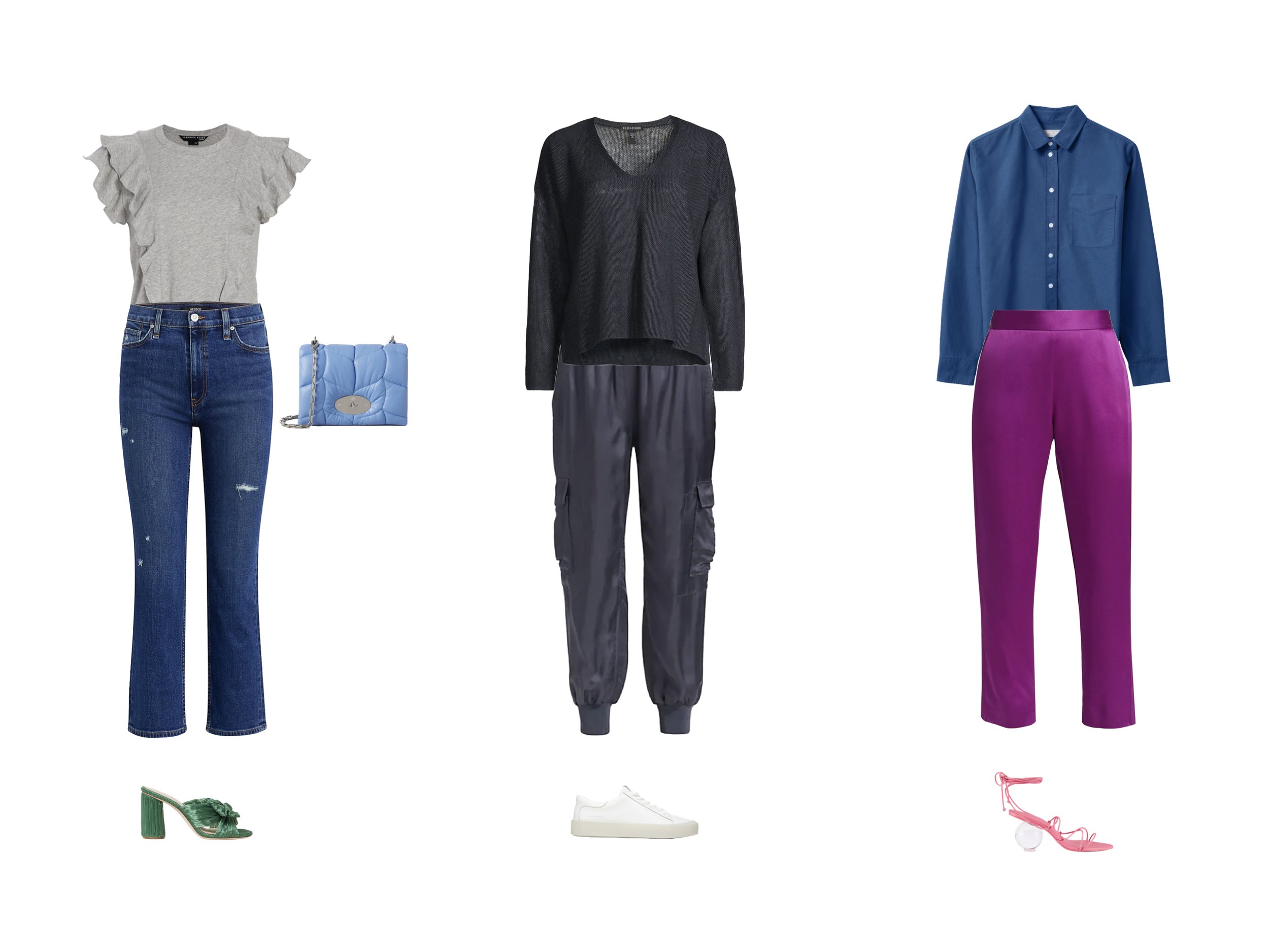
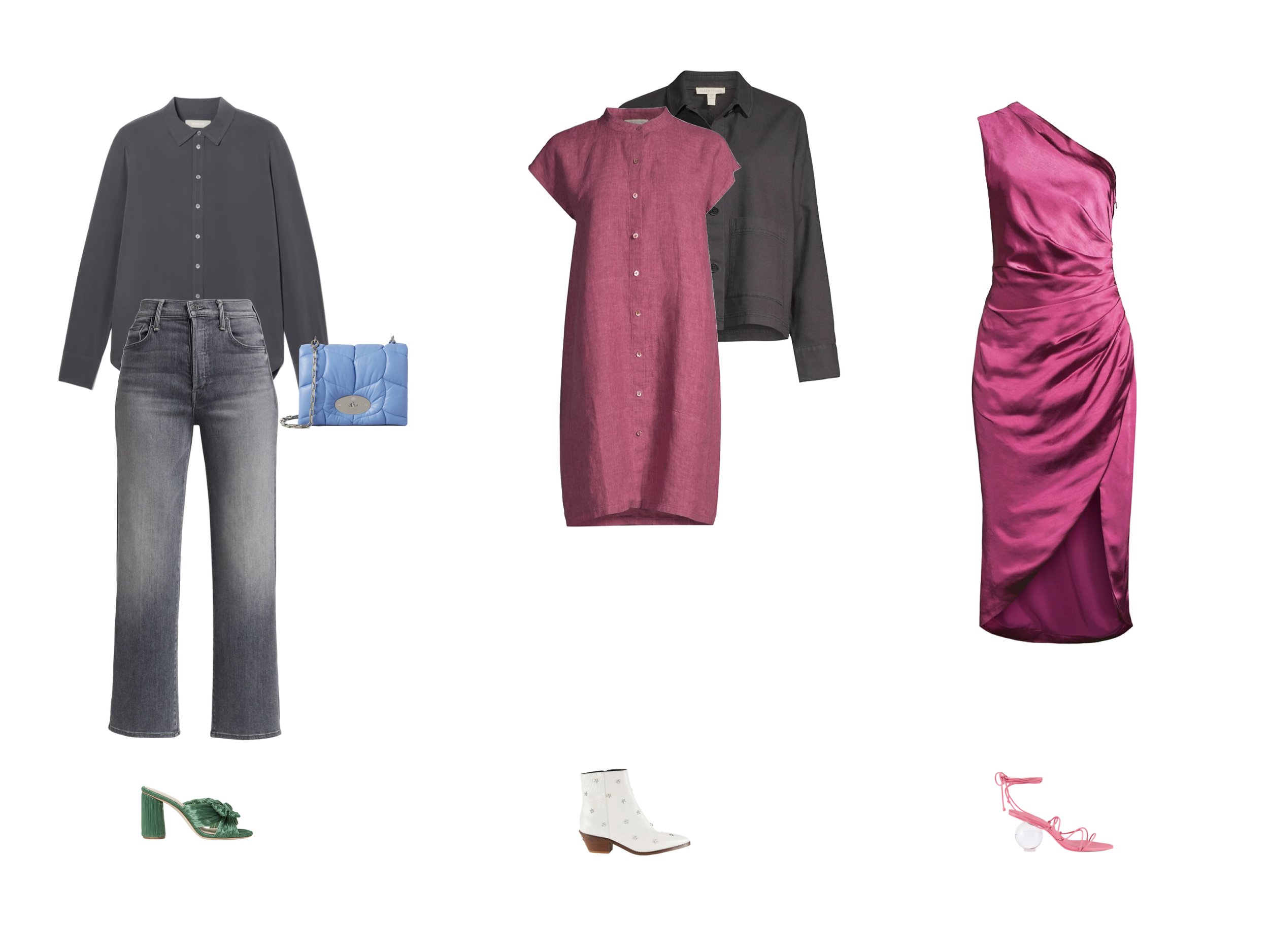
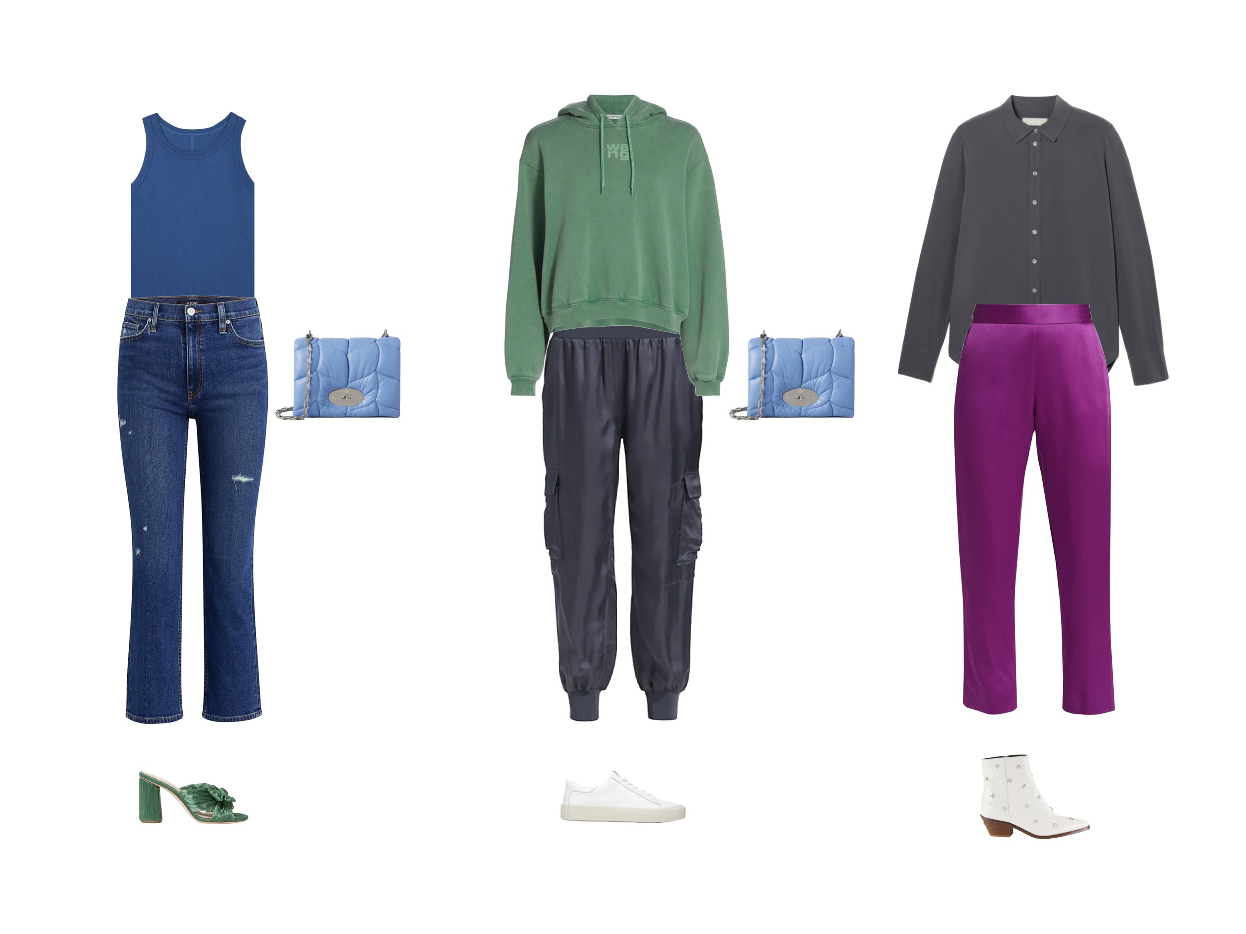
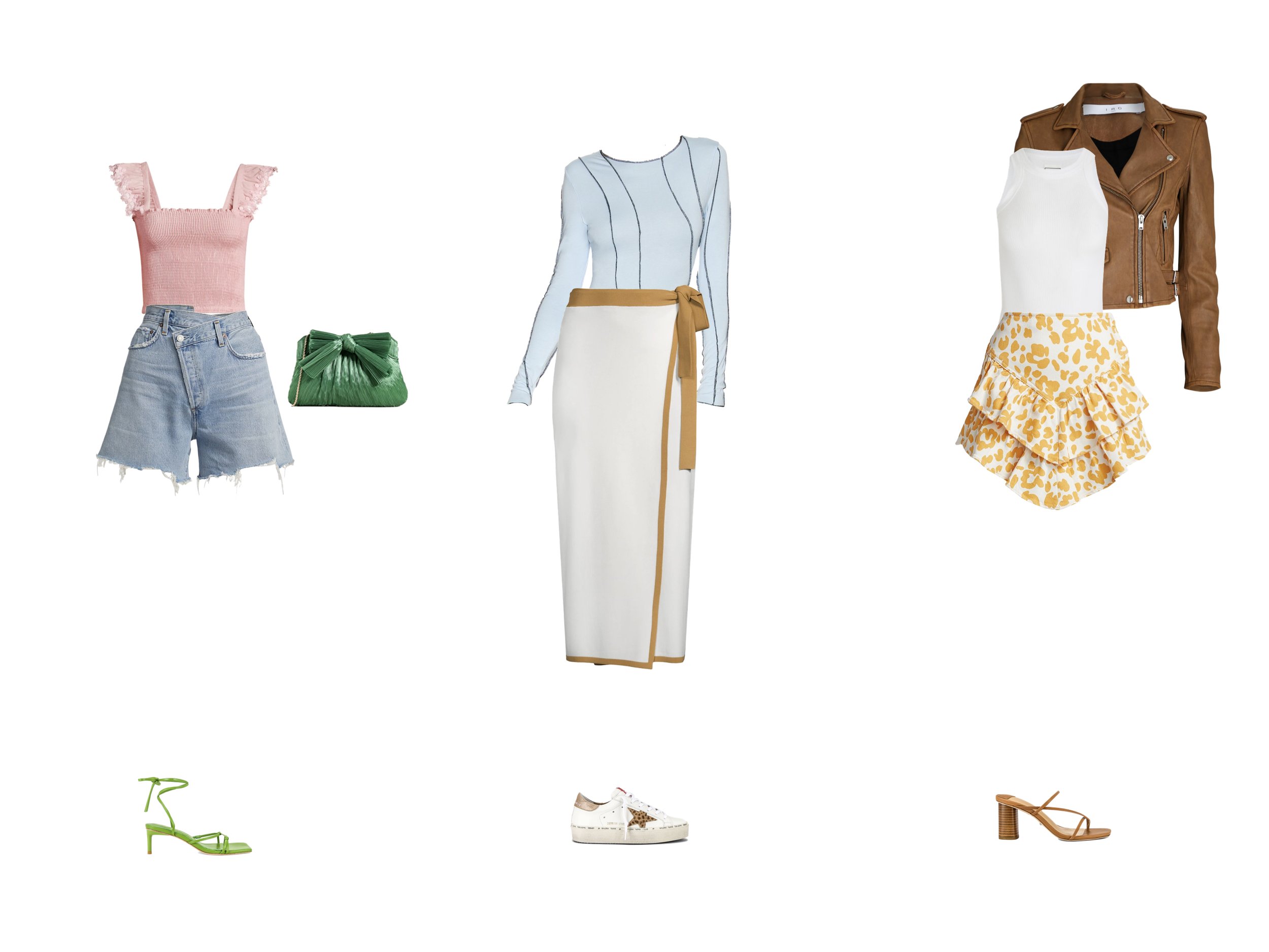
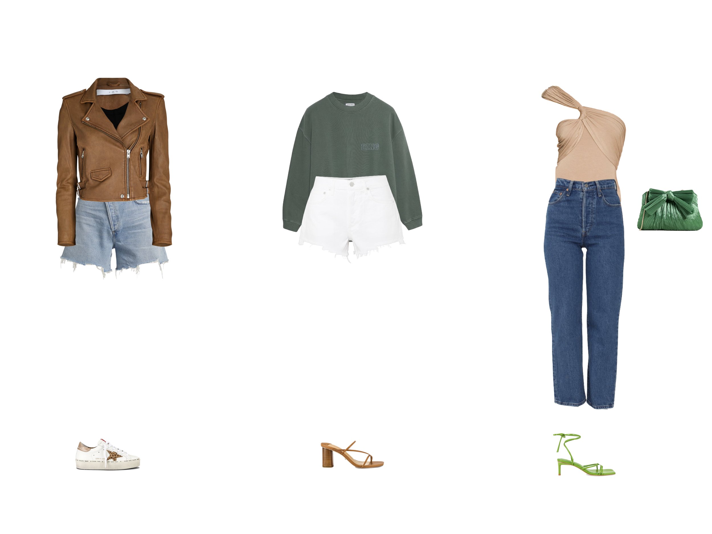
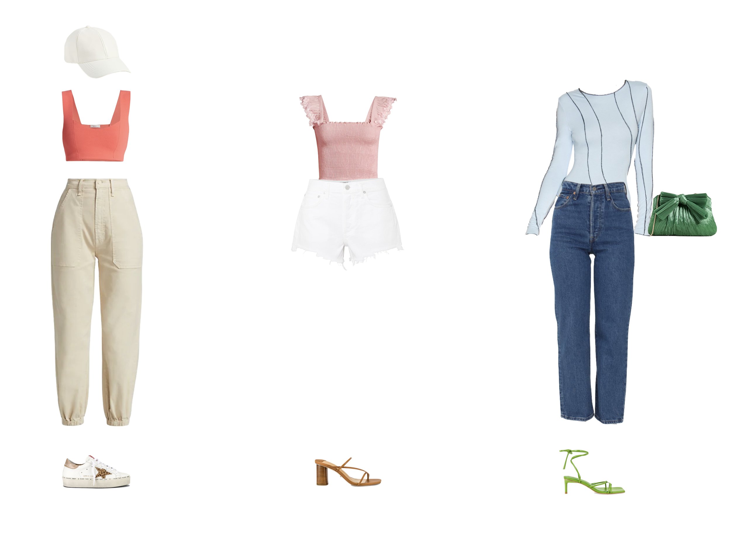
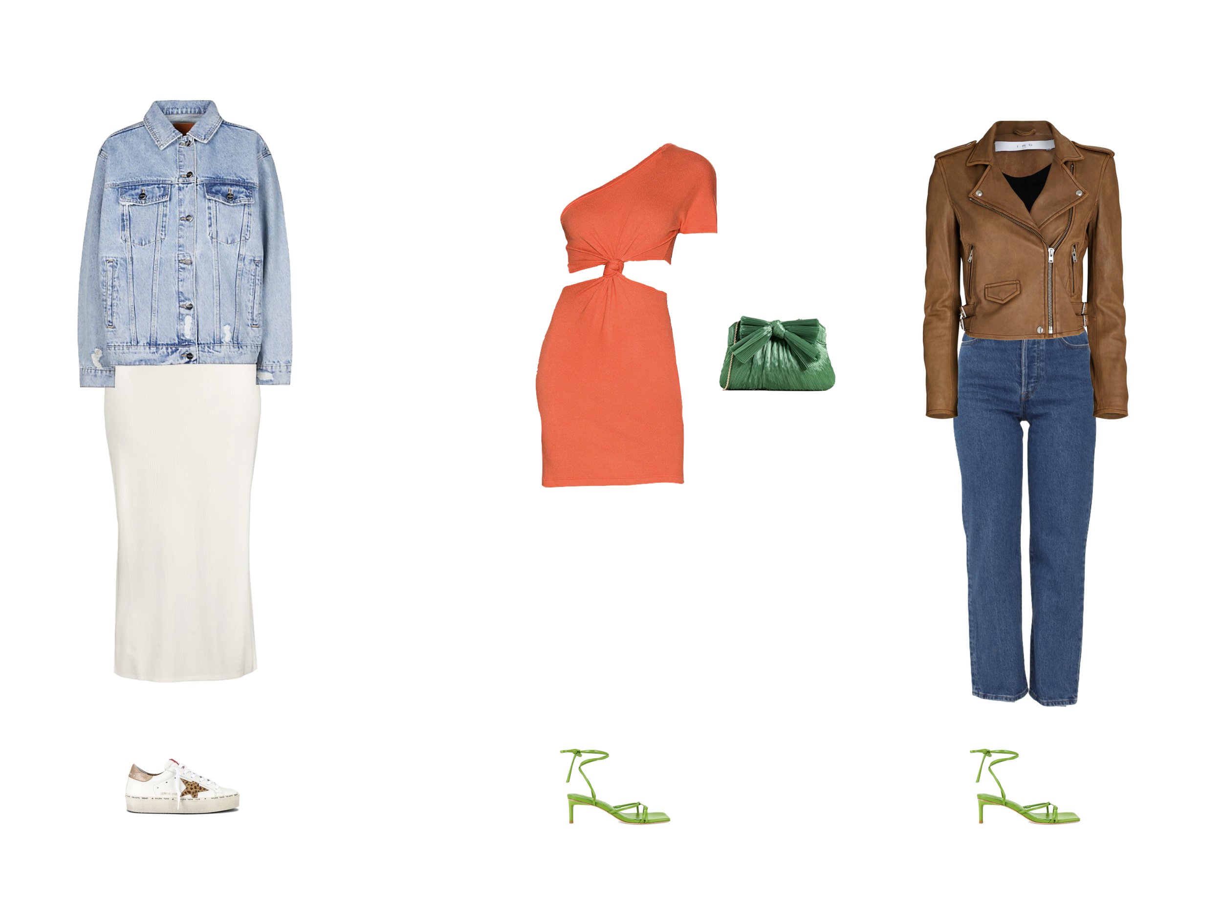
Knowing your color type is crucial for honing your personal style. If you’ve explored my channel before, you’ll probably know that color and body type form the cornerstone of every successful capsule wardrobe. Knowing your color type will help you understand why you enjoy wearing certain colors and why others may not work for you. And if you want to wear colors that don’t fall within your color type, understanding how to prioritize your color characteristics will allow you to do so intentionally and with confidence. So today, I’m going to share my three most valuable tricks for narrowing down your color type and prioritizing your natural characteristics.


If you’re new here, this year we are diving deep into The 12 Competencies of Personal Style together, to help you get organized, discover your personal style, and start to build your dream wardrobe. That’s why I’d like to invite you to join the 12-month free email course! By the end of the year, we will master these 12 useful concepts and develop your personal style, so that you can consistently create outfits that you love to wear, and ultimately build your perfect capsule wardrobe.

The 12 competencies of personal style are:

  • Color Type

  • Body Type

  • Core Style

  • The Wardrobe Framework

  • Wardrobe Editing

  • Fit & Measurements

  • Silhouette & Proportions
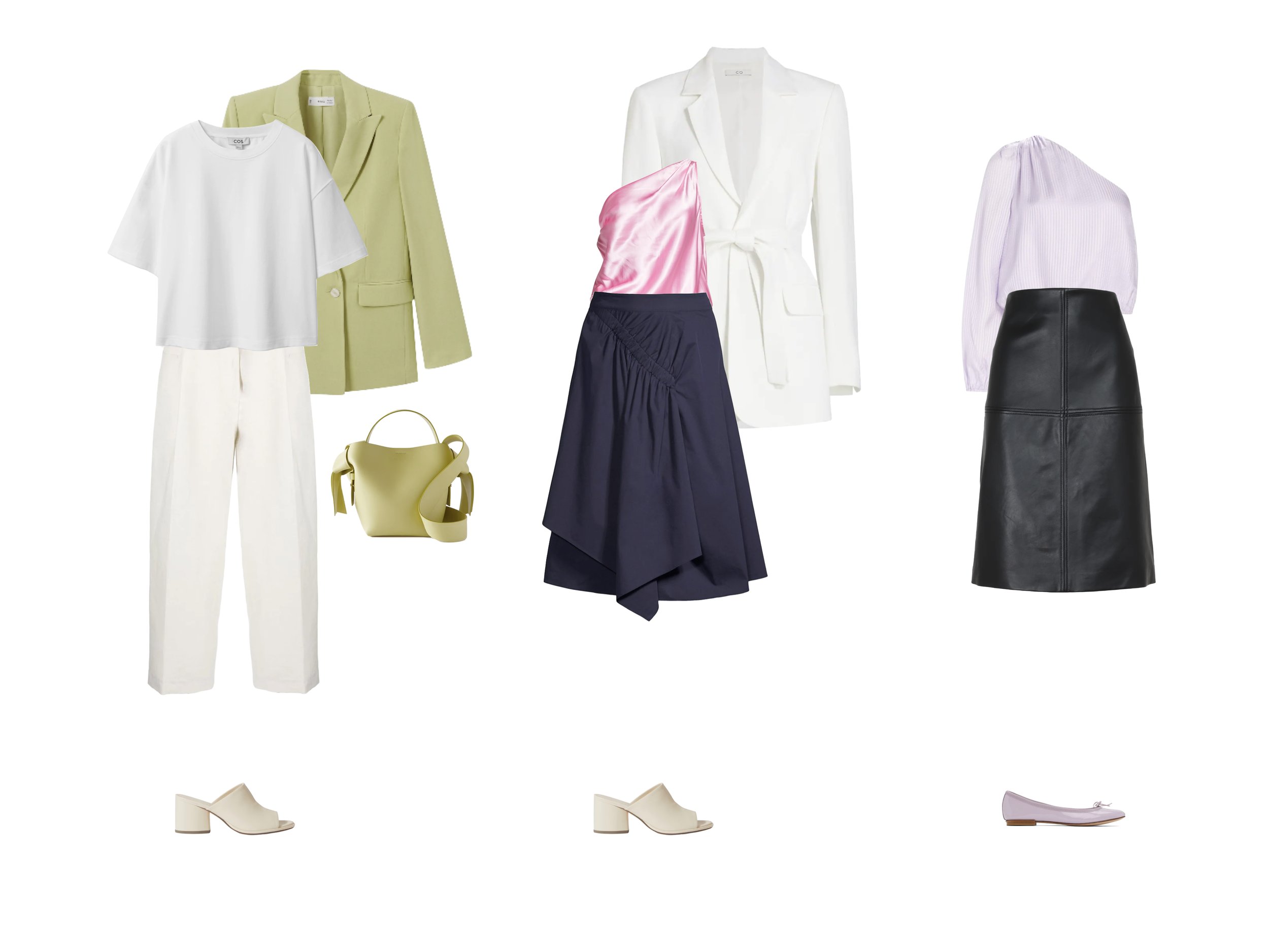
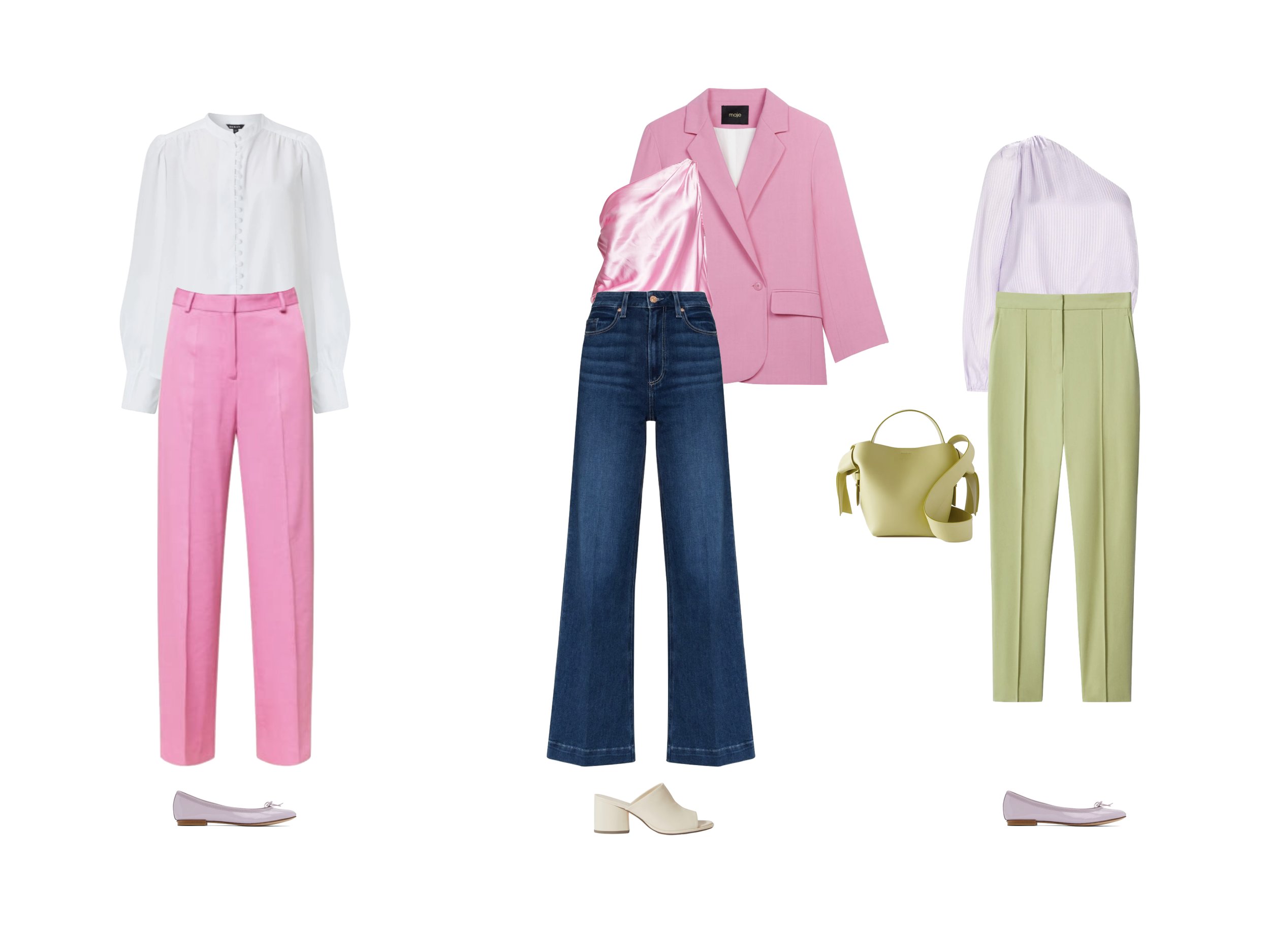
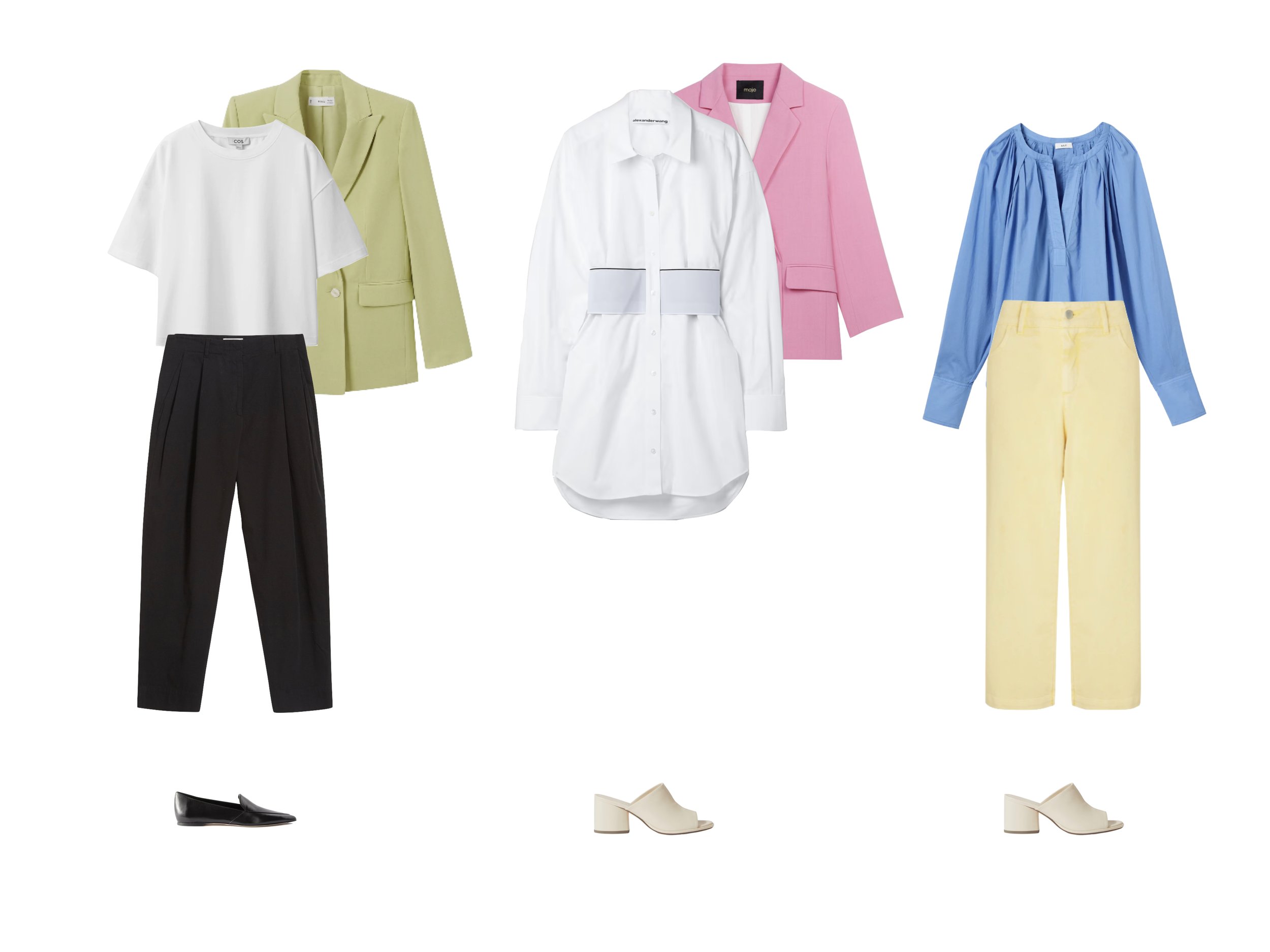
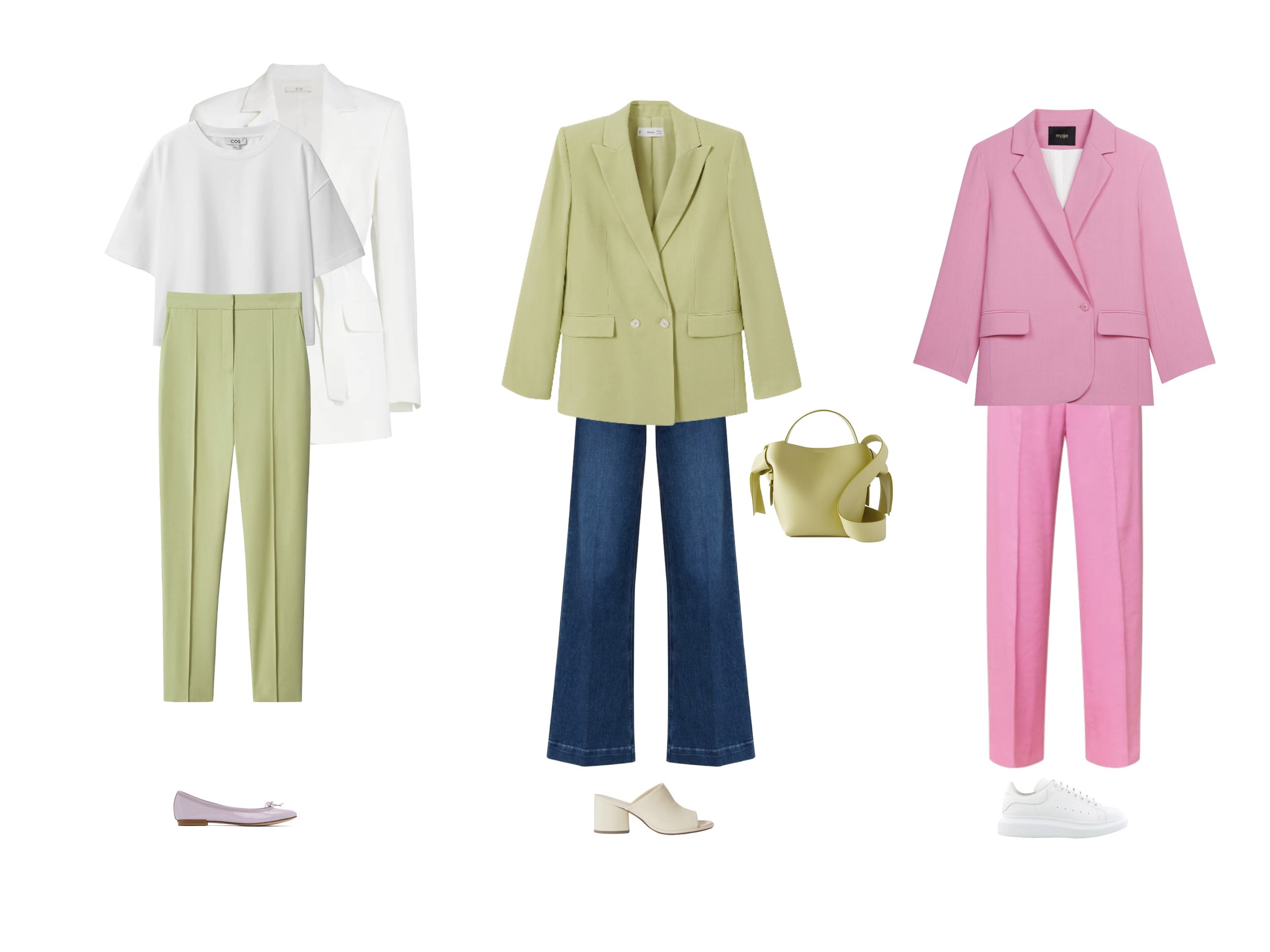
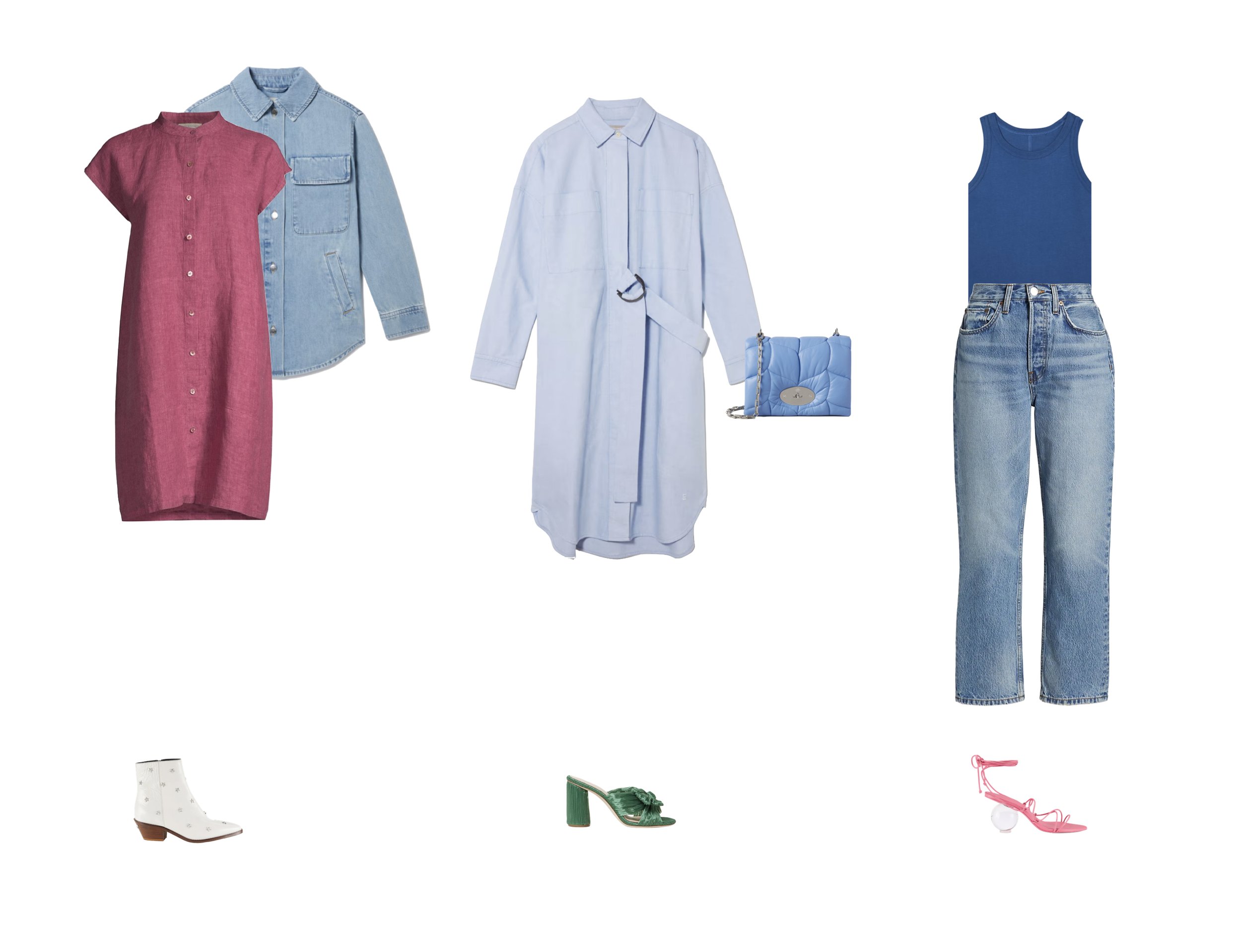
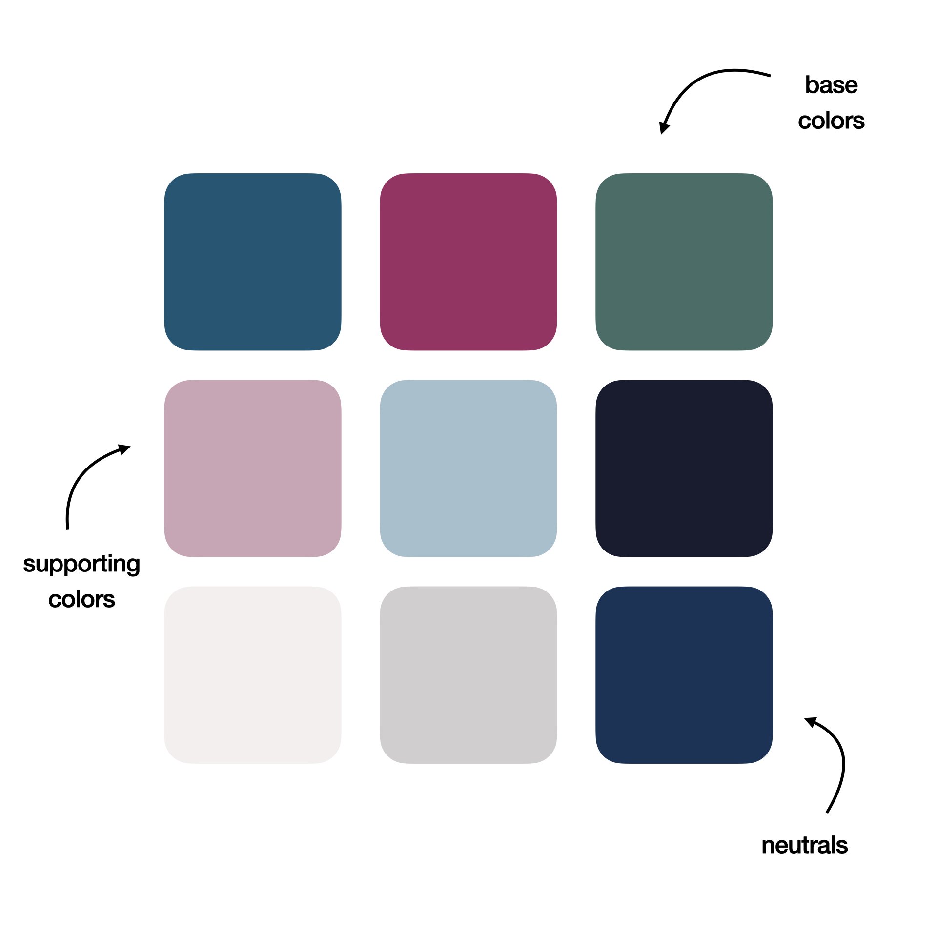
  • Color Story

  • Texture

  • Multidimensional Style

  • Conflict & Balance

  • and Creating Full Outfits

Let’s start with a quick overview of the 3 Dimensions of Color.

The 3 Dimensions of Color

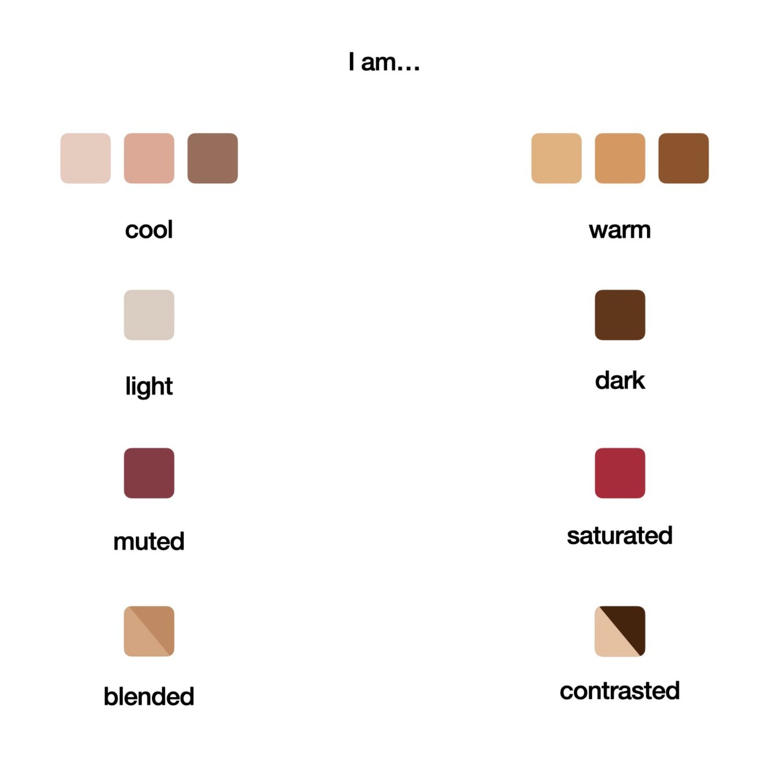
All colors can be fully defined in terms of three dimensions: hue, value, and chroma.

Hue and Temperature

Hue is the “pure” or spectral color that is most closely related to a given color. It is the attribute by which colors are most commonly classified. For example, red, green, or blue.

In color analysis, a color’s temperature is the most important aspect of its hue. The temperature of a color is defined by its hue. A hue’s temperature can be cool, warm, or neutral. Temperature can also be viewed as warmer or cooler relative to other hues. So color temperature is not purely subjective, it is also relative. For instance, blue is generally considered to be a cool color, but when we look at a range of different blues, we can see that there are warmer shades and cooler shades of blue.

In general, adding blue to a color will make it cooler, and adding yellow to a color will make it warmer. Pure red is neutral - a cool color mixed with red will remain cool, and a warm color mixed with red will remain warm. True green is also a neutral, having equal parts of yellow and blue.

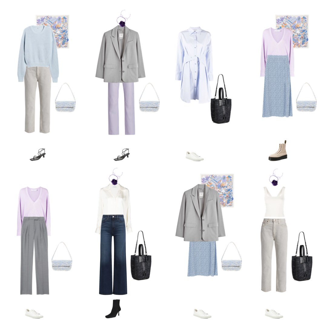
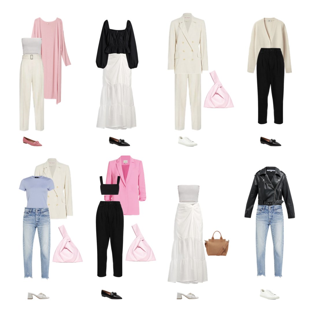
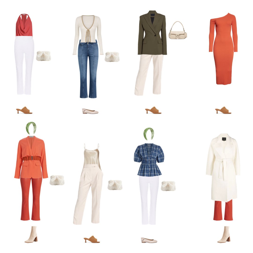
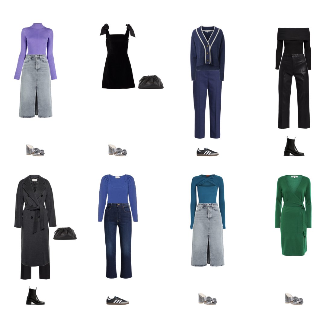
In seasonal color analysis, Spring and Autumn are warm seasons while Winter and Summer are cool seasons.

Value

Value is the lightness or darkness of a color. It is the attribute by which color is scaled from black to white. Value can be determined by desaturating the color to identify the most closely related shade of gray.

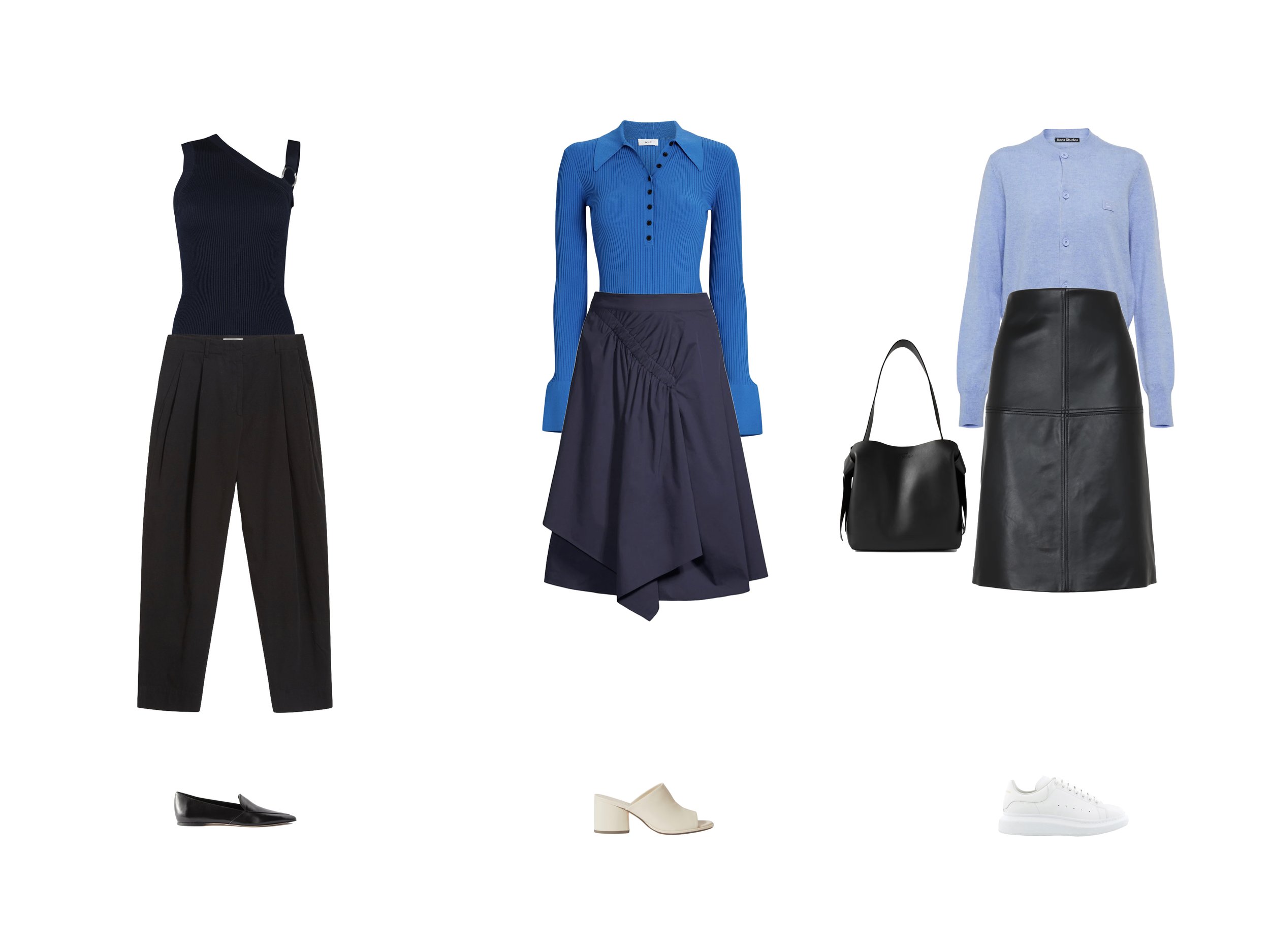
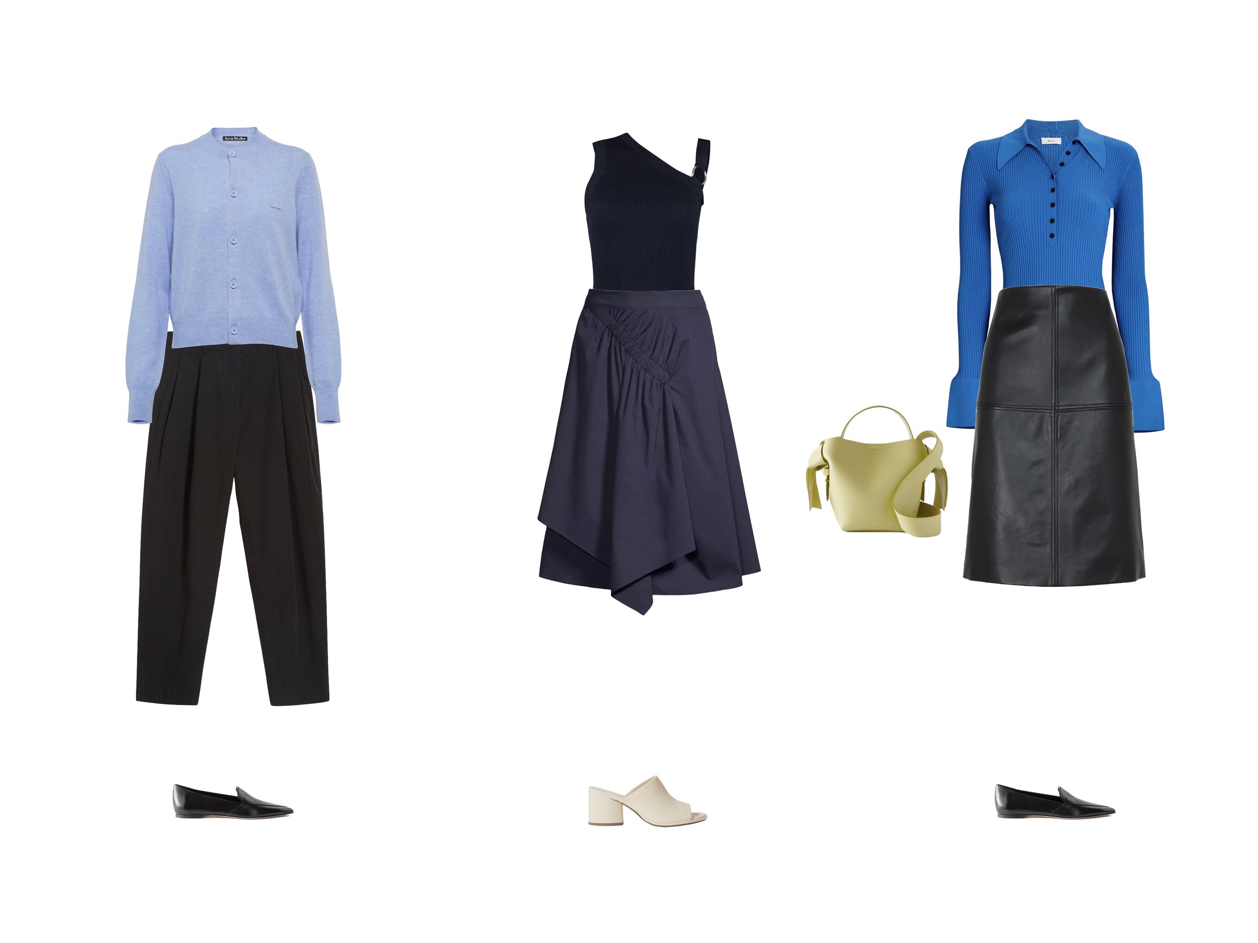
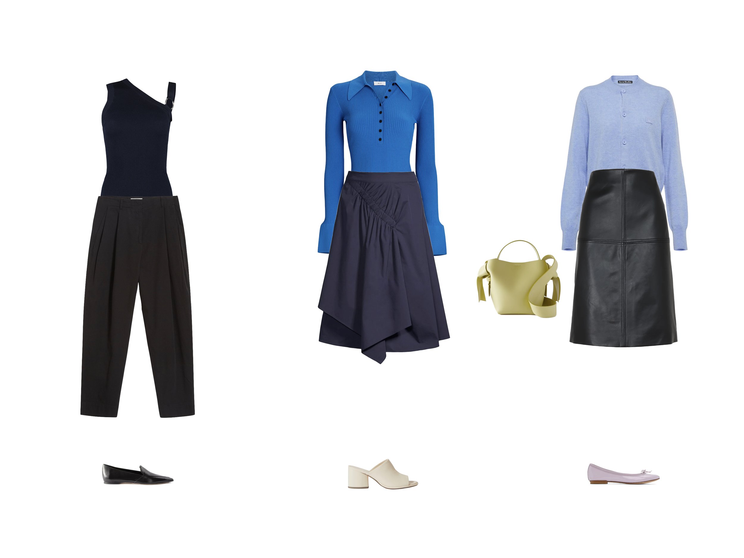
In color analysis, a season’s value also indicates its level of contrast. Dark seasons, like Winter and Autumn, have higher contrast within their palettes than the lighter seasons of Spring and Summer. Winter is the darkest most contrasted season, and the only season for which pure black and pure white are usually recommended. Next we have Autumn and Spring with medium contrast. And Summer is the least contrasted season.

Chroma

Chroma is the brightness or softness of a color. It is the attribute by which a color is visually different from its most closely related shade of gray. Adding gray to a given color results in a softer, or more muted color. Mixing complementary colors has a similar effect.

Autumn and Summer are muted seasons while Spring and Winter are bright seasons.

In seasonal color typing, each of the basic seasons is defined by a combination of temperature, value, and chroma.

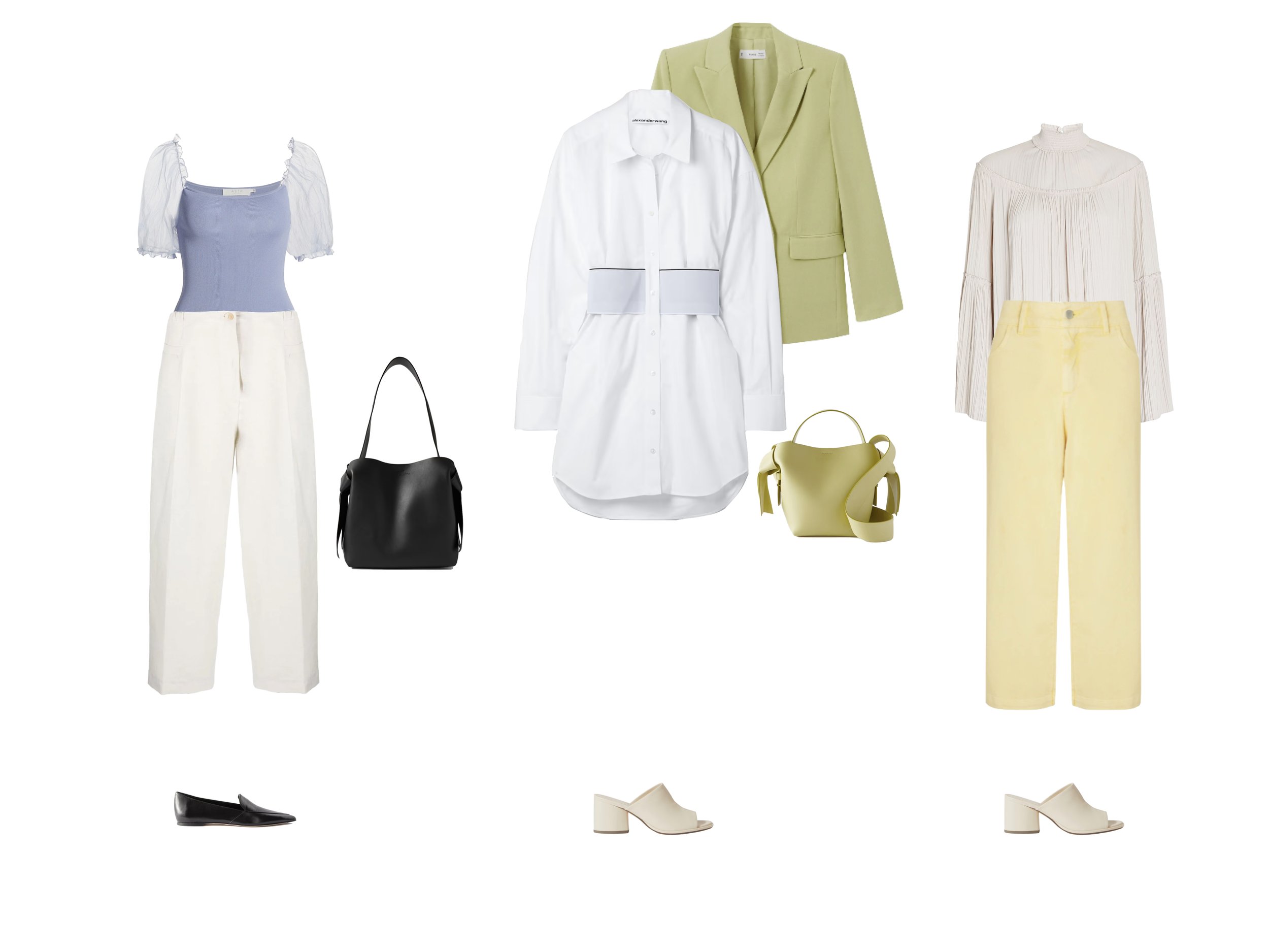
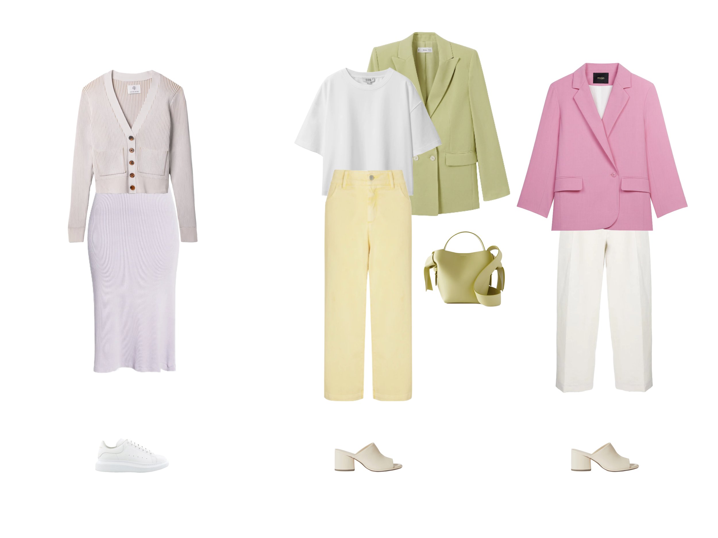
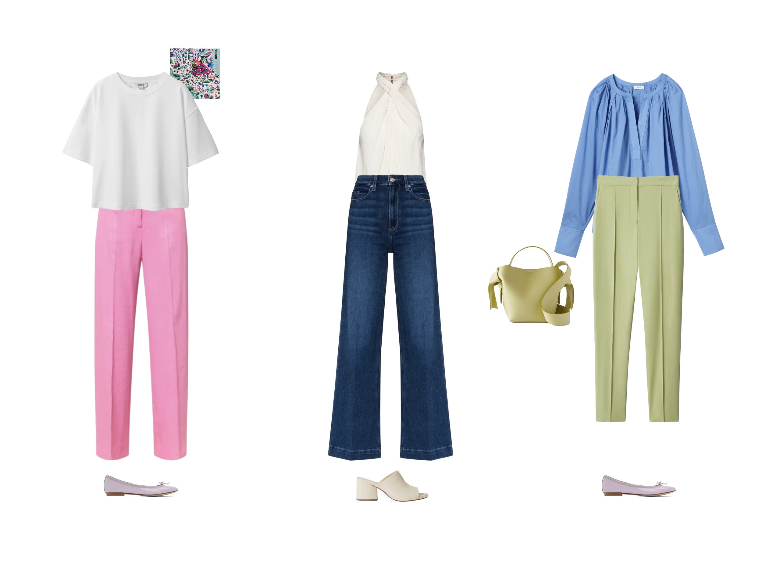
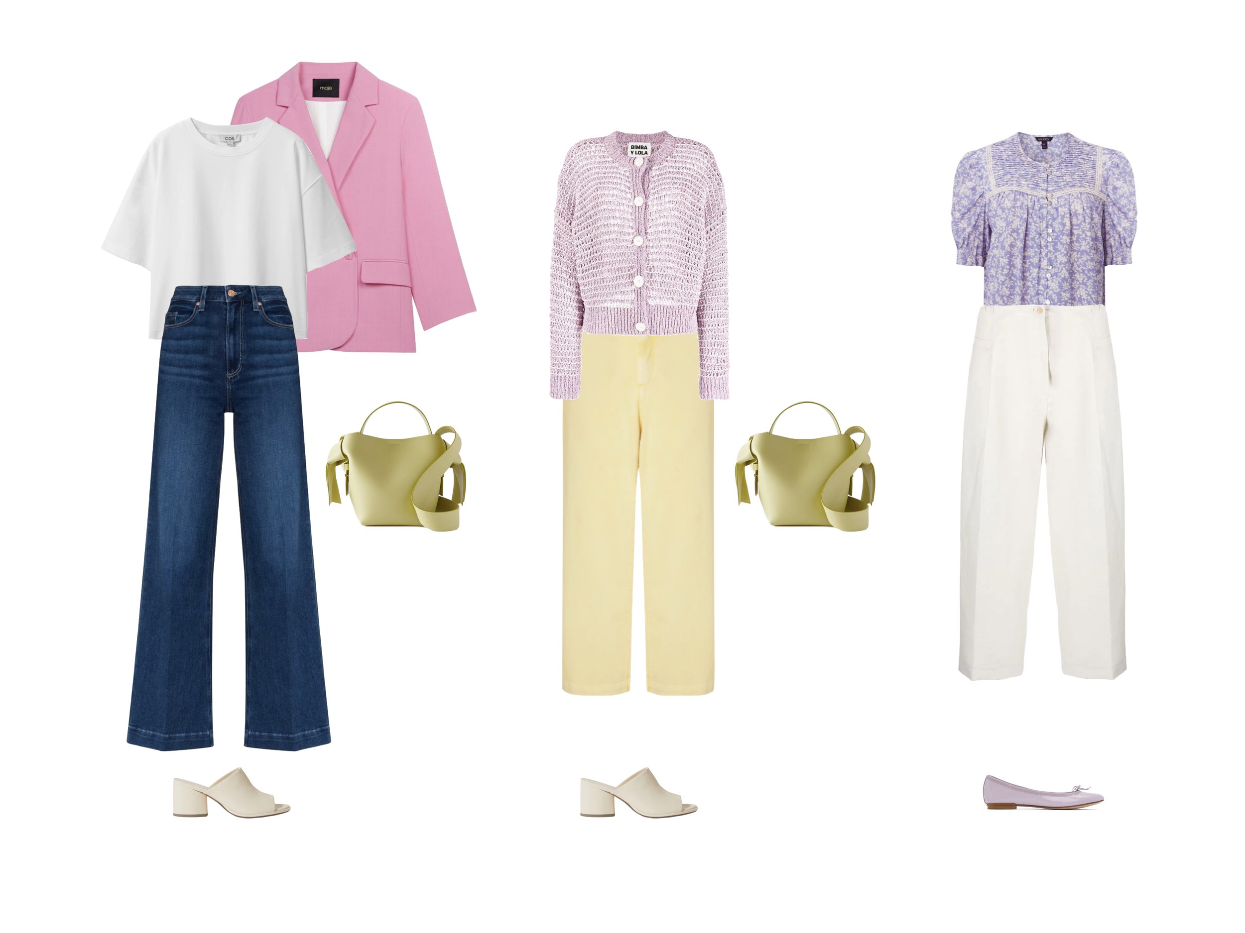
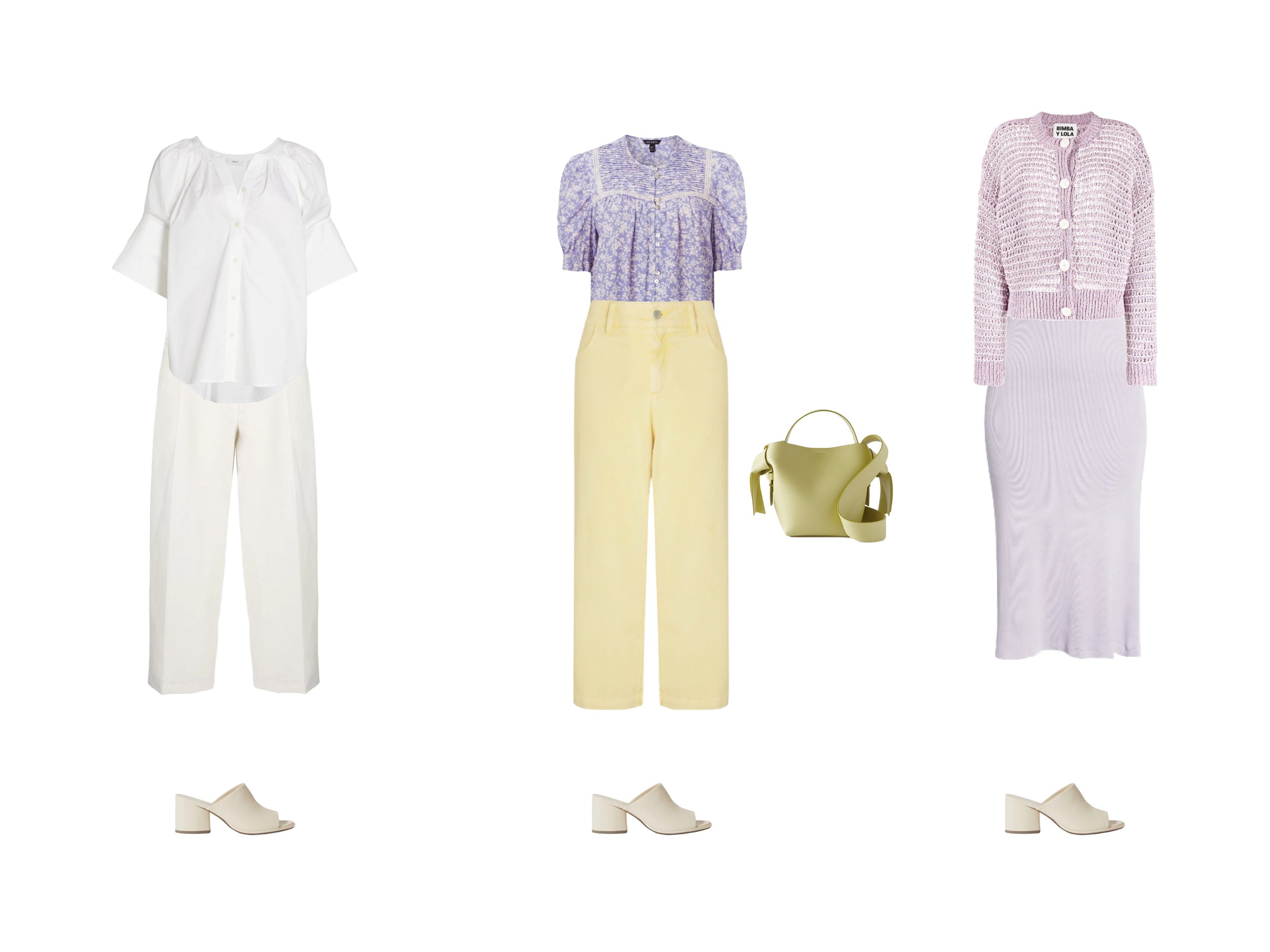
  • Spring is warm, light, and bright.

  • Summer is cool, light, and muted.

  • Autumn is warm, dark, and muted.

  • Winter is cool, dark, and bright.

Then, each subtype is further defined by its primary characteristic. Your primary characteristic is the most important characteristic to match when choosing colors for your color palette. Your primary characteristic is either cool, warm, light, dark, soft, or bright.

  • Light Spring’s primary characteristic is light.

  • True Spring’s primary characteristic is warm.

  • Bright Spring’s primary characteristic is bright.

So, now that you understand how each color season is defined using The 3 Dimensions of Color, let’s get into these tricks, because I know they are going to be game changers in the way that you think about your color season.

Trick #1: Black and White

Whenever I’m color typing my clients, the very first thing that I do is assess how they look in pure black and pure white. As I mentioned earlier, Winter is the most contrasted color season, and the only season for which pure black and pure white are typically recommended. This means, if black is one of your best colors and you have a cool undertone, then you can narrow down your color season to one of the Winter types. If you feel that black is one of your best colors and you have a warm undertone, then you must be either Dark Autumn or Bright Spring. If black is one of your worst colors, you can instantly eliminate all of the Winter types.

Trick #2: Use Your Worst Colors

Speaking of our worst colors, analyzing the colors that are least flattering on us is a super powerful tool for narrowing down our color seasons. Go into your wardrobe and pull out any colors that you hate to wear, write them down from memory, or if you’ve joined the course you will be receiving a free swatch library which you can page through to identify your worst colors.

Now, how would you describe these colors? What characteristics do they share? Are they light or dark? Do they have warm or cool undertones? Are they bright and clear colors, or complex and muted colors? If so, write down those key words: cool or warm for temperature, bright or muted for chroma, and light or dark for value. It’s okay if you only see one commonality. Just write down what you see. These common themes represent characteristics that are disharmonious with your natural beauty.

Temperature and brightness tell us the most about our coloring, so focus on eliminating seasons that don’t suit your undertone and chroma first. If one of your disharmonious characteristics is “muted,” then you can eliminate the Autumn and Summer types. If you dislike all warm colors, then eliminate Autumn and Spring.

With value, I make an exception. I don’t believe that you should eliminate entire seasons based on how well you suit light or dark colors. However, you can eliminate specific subgroups. So, if one of your disharmonious characteristics is “dark,” then you won’t be Dark Autumn or Dark Winter.

And if one of your disharmonious characteristics is “light,” then you can eliminate Light Spring and Light Summer. However, I would not recommend that you eliminate Spring and Summer altogether. I often see clients who are cool and muted, but think they must be Winter because they don’t suit light colors. In reality, they are Summers whose primary characteristic is either cool or muted, rather than light. Therefore they look great in dark, cool, and muted shades within the Summer color palette.

Trick #3: Your Sister Season

Now that you’ve eliminated some possibilities by analyzing your worst colors, you can probably determine which of the four basic seasons suits you best - Spring, Summer, Autumn, or Winter. So how do you finally determine your subtype? This is where the concept of Sister Seasons has been extremely illuminating for me and my clients.

Your Sister Season is such an illuminating tool because it offers an easy process of elimination for determining your exact seasonal subtype.

So what is your Sister Season?

Sister Seasons are pairs of seasonal palettes that share the same primary characteristic - light, dark, bright, soft, warm, or cool. Your Sister Season is the only seasonal subtype that will suit your natural coloring even though it lies outside of your basic season family.

So, if your specific subtype is Bright Winter, then your Sister Season is Bright Spring, both of which share the primary characteristic “bright.” If your specific subtype is True Autumn, then your Sister Season is True Spring, both of which share the primary characteristic “warm.”

Now, you can easily use the concept of Sister Seasons to confirm your seasonal subtype.

Let’s say you know you think you belong to the Bright Spring color type. You can confirm this by trying on colors from Bright Spring’s Sister Season, Bright Winter. If you are a Bright Spring, then the Bright Winter color palette will suit you as well. The same idea holds for all other color types.

If you have no idea where to start, then try on colors from all three potential Sister Seasons. If you know you are in the Spring color family, you’ll try Light Summer, True Autumn, and Bright Winter. When I use this exercise with clients, it becomes very clear which two options are least suitable. If you are a Bright Spring as in the previous example, then True Autumn colors will look too warm on you, and Light Summer will look too muted.

Now that you’ve learned my three most valuable tricks for determining your color type, I hope you’ll be able to confidently choose your color season and start building your wardrobe color palette! Don’t forget to sign up for the course to get access to the free swatch library and all of the exercises to guide you through the process.

And if you’re still struggling with your color type, my color and body typing service is always available for the price of a haircut. Plus, if you send me a DM on Instagram I would be happy to give you a discount code to get you started.

Just remember that color type is not a set of rules that you must apply to your wardrobe; it is a lens through which to see your outfits and your wardrobe more clearly. Each of The 12 Competencies of Personal Style is a tool to add to your personal style toolbox, to help you confidently and consistently create outfits that work for your life and your style. So have fun first and foremost!


You May Also Enjoy…

Plan With Me! Nashville Travel Capsule Wardrobe

Travel Capsule Wardrobe | Summer Season | Winter Color Type


34 Pieces // 105 Outfits

Hey everyone! Today I thought it would be fun to take you through my entire process of creating my travel capsule wardrobe for an upcoming trip to Nashville. I think this will be really useful because not only will it give you some ideas for your next travel capsule, it’s also kind of a microcosm of the capsule wardrobe curation process. So you can take these exact steps and apply them when you create your day-to-day capsule wardrobe as well.

The Planning Process

What are Your Goals?

The first thing I ask myself any time that I’m planning a wardrobe is: what are my goals for this season or this trip?

My main goal for this capsule is to create a few new looks that represent my current style and maybe try a couple new silhouettes or textures. I also want to focus on completing the looks with the right accessories to achieve a moderate level of visual interest and ensure that they aren’t too basic.

Create Your Calendar

Next, I put together a calendar of all of the activities I have planned for the trip or season ahead. This helps me figure out how many outfits I’ll need for each activity.

For our Nashville trip, we are taking our dog Basil, so we will be taking two travel days on each end of the trip to drive down. On the first leg of the trip, we plan to stay in a rural area with a farm nearby, so I think we might like to go for a bit of a nature walk after driving in the car all day. The next day, we will arrive in Nashville so I think we might find a nice place to go for dinner and drinks. Over the weekend, I’ll be attending a bridal shower and a wedding, so I need very specific outfits for each of those events. Now, I’ll fill out the rest of the calendar with various activities that I think we will want to do, like going for coffee, meals, and doing some sightseeing.

If you’ve ever been to Nashville, what was your favorite part of your trip? I’d love to hear your suggestions in the comments!

Based on my calendar, I’ll need at least:

4 - Travel Outfits

4 - Daytime Activity Outfits

5 - Dinner/Drinks Outfits

2 - Concert/Bar Outfits

1 - Bridal Shower Guest Outfit

1 - Wedding Guest Outfit


Start With What You Have

So, now that I know how many outfits I need for each activity, I’ll start building the capsule with items that I already own. I keep a folder on my computer full of images of everything in my wardrobe, so I can easily drag and drop them into a Keynote to visualize my capsule (watch the video to see how). I highly recommend doing this for your own wardrobe if you can. Every time you buy something new, take a screenshot and save it to your own wardrobe folder. This will make planning your future capsule wardrobes so much easier.

For my Nashville capsule, I’ve pulled together a bunch of band tees, some tank tops, a tube top, a couple of button-down shirts, and a couple of knit tops with interesting necklines. I’ve also added some jeans, a pair of wide-leg culottes, and a couple pairs of shorts, three dresses, one leather jacket, and a few pairs of sneakers and low-heeled sandals. I thought about adding some western-style boots, but I think it will be a bit too hot for the ones that I own, and these wouldn’t do well in rainy weather either. I also added two bags, my Chanel classic flap and this really cool Cult Gaia Ark bag that I love for summer and always get so many compliments on. And let’s add a pair of sunglasses too (keep scrolling to the final capsule for links to all the items).

Identify Gaps

So this is a really good start, but there are a few gaps that I can see right off the bat. First of all, I only have two pairs of shorts and they’re both denim cutoffs. Since it’s going to be pretty hot during most days, I’m going to need to add a few more pairs of shorts so that I don’t end up wearing the same two pairs every day. I also need to add another pair of shoes that will be comfortable to walk around in during the day.

If you want to extend the life of your shoes, it’s important to rotate between at least two pairs so that you can give each pair a rest for at least a day between wears. This will allow the shoe to relax back into its intended shape and help to keep them looking nice and new as long as possible. 

I also might want to add a pair of stylish, weatherproof boots for rainy days. I also only have one jacket selected. I should probably either choose a couple more jackets from my existing wardrobe or add a new one so that I have more options. I’ve also been on the lookout for the perfect denim jacket, so maybe I’ll see if I can find one.

Gather Inspiration

Before we go shopping for anything new, let’s gather some inspiration to help paint a visual picture of what this capsule could look like. I’m going to head over to Pinterest and create a board where we can start dumping some photos.

As I’ve been thinking about this trip, I’ve come up with a few trends or themes that I want to include. Check out my Pinterest board for some examples!

Monochrome

The first theme is monochrome. As you might have noticed, I have a lot of monochromatic outfit options in black and gray, but I want to start adding more monochromatic outfits in other colors. 

Boxer Shorts + Oversized Shirt

I’ve also noticed this trend of wearing boxer-style shorts with a matching, oversized shirt which I think looks really cool and chic. It definitely meshes well with my personal style and looks like it would be a really comfortable daytime vacation outfit.

Athleisure

Since we are going to be walking around a lot, this trip will also be a good time to add some athleisure elements. I’ve also been eyeing the Prada Cleo bag ever since I included it in my Spring/Summer outfit formulas video a while back, and I think it really amps up the athleisure vibe and takes casual outfits to the next level.

Go Shopping!

Now that we’ve collected some inspiration and have a better idea of the creative direction for this capsule, let’s go shopping! Watch the video to see my process!

The Final Capsule

The final capsule includes 34 items and can create at least 105 outfits. The color palette for this capsule is a deep and moody combination of red, blue, navy, emerald green, black, white, and cream. The color palette is cool, deep, and saturated, great for the winter color type.

11 Tops

blue striped shirt (OR) // black tube top // cream bing tee // white ribbed tank // green anine bing tee // black one-shoulder knit (OR) // white one-shoulder tank (OR) // red off-shoulder knit // black one-shoulder tank (OR) // linen shirt // charcoal bing tee


3 Dresses

white linen wrap dress (longer version) // navy strapless cocktail dress // black linen wrap dress (similar)


105 Outfits


You May Also Enjoy…

How to Master the Smart Casual Dress Code: A Radiant Workwear Capsule Wardrobe

Smart Casual Dress Code | All Seasons | Summer Color Type


35 Pieces // 156 Outfits

So today, let’s talk about the enigma that is the Smart Casual office dress code. Plus, I’ll be sharing a Smart Casual work wardrobe for the summer color type. But first, what is Smart Casual, what kinds of things can you wear, and how should you put together Smart Casual outfits for work?

What is the Smart Casual Dress Code?

The Smart Casual dress code can be ambiguous and encapsulates a range of different clothing items and outfit combinations. Smart Casual requires full looks that include a balance of polished business attire with relaxed elements. This is great because it provides opportunities for you to bring more of your personal style into your workwear wardrobe. However, it can feel challenging to create the perfect balance of casual pieces and formal business attire. 

Especially if you are aiming to create a minimal capsule wardrobe full of Smart Casual outfits, some outfits will naturally come off more formal or more casual. However, creating a Smart Casual capsule wardrobe might not be as challenging as you think. A few key accessories, like a pair of heels, casual flats or polished sneakers, a colorful scarf or funky earrings can be tools in your arsenal to dress up your more casual outfits or dress down the formal ones. Plus, it can be great to have more formal outfits for presentations, meetings with clients, or interviews; and more relaxed ones for casual Friday or after-work events.

Smart Casual vs Other Dress Codes

Smart Casual is probably the most relaxed office dress code. While a creative office might allow for less polish or refinement in an outfit, expectations for creative execution are likely to be higher.

Smart Casual is more versatile and flexible than business casual, allowing for more color and a wider range of items that can be appropriate, like dark wash denim, shirt dresses, and jumpsuits which aren’t typically considered appropriate for business casual. While many people may opt for neutral color palettes, there is room for brighter color combinations in most Smart Casual environments.

Smart Casual also offers opportunities to wear very formal pieces, like suit separates, that are usually associated with Formal business attire. Although a traditional full matching suit in a conservative color worn with a crisp white shirt and heels which would be right at home in a Formal office would probably come across much too formal for a Smart Casual office.

Smart Casual Pieces

Some examples of smart casual pieces include:

Dresses

  • Knee-length or midi-length collared shirt dress

  • Knee-length or midi-length wrap dress

Bottoms

  • Dark wash blue or black jeans without distressing

  • Trousers

  • A-line Skirts

  • Pencil Skirts

  • Flowy Skirts

Tops

  • Cardigan

  • Camisole

  • Blouses

  • Button-up shirts

  • Fine knit sweaters

Tailoring

  • Relaxed suits

  • Formal jumpsuits

  • Blazers

Shoes

  • Ballet flats

  • Loafers

  • Low heels

  • Mules

  • Clean polished sneakers


The Smart Casual Capsule Wardrobe

The final capsule includes 35 items and can create at least 156 outfits. The color palette for this capsule is a light and radiant combination of lavender cornflower blue, and cool pink with pops of yellow and muted lime green. To provide some grounding for the looks, over 50% of the items are neutrals in off-white, white, navy, and black. The color palette is cool, light, and soft, great for the summer color type.

15 Tops

beige cardigan // lavender floral top // blue cotton shirt // blue knit polo // off-white flowy top // short sleeve white shirt // navy asymmetric tank // lavender one-shoulder top // white t-shirt (or this one) // lavender open-knit cardigan // cornflower blue cardigan // white vintage style top // pink one-shoulder bodysuit // cream halter top // blue puff-sleeve top


2 Suits + 1 Blazer

white tie-waist blazer // pink suit jacket // pink suit pants // chartreuse suit jacket // chartreuse suit trousers


156 Outfits


You May Also Enjoy…

A Vibrant & Chic Summer Caspule Wardrobe for the Spring Color Type

Summer Season | Spring Color Type


30 Pieces // 120 Outfits

Today I have another color palette example for you, plus some tips for summer layering and mixing prints in a capsule wardrobe. This example is inspired by Jasmine who has been typed as a spring color type and is looking to incorporate more bright, spring colors into her wardrobe. 

Jasmine mentioned that she was typed as a Blue Spring by House of Color. While I took a more general approach to creating this capsule wardrobe color palette, I will note that the end result lies somewhere between the Paint Box Spring and Blue Spring color types from House of Color. 

Jasmine has a casual, chic style with feminine touches and she values ease and practicality. She likes to wear jeans and leggings, but she prefers to avoid boxy trousers and high heels. She also wants to incorporate layering into her wardrobe.

Taking all of this into account, let’s see what kind of capsule wardrobe we can create for Jasmine!

The final capsule includes 30 items and can create at least 120 outfits. The color palette is warm and bright, great for the spring color type.

Building Jasmine’s Color Palette

I don’t know much about Jasmine’s coloring other than that she was typed as a spring. Let’s assume that she is warm, light, saturated, and contrasted.

For her base colors, let’s choose grass green and juicy orange. Then, for supporting colors, let’s add true red which is analogous to orange, as well as light blue to compliment her blue spring color type. For neutrals, a variety of warm tans, cream, white, and black will help to tone down and balance the bright color palette, providing more versatility in her outfit selections.

The final color palette is a bright and juicy combination of grass green, bright orange, true red, light blue, white, black and tan - perfect for a bright spring color type.


Summer Layering Ideas

Mixing Prints in a Capsule Wardrobe

A Vibrant & Casual Capsule Wardrobe

The final capsule includes 12 tops, 8 bottoms, 1 dress, 3 jackets, 4 shoes, and 2 bags, for 30 items which can create at least 120 interchangeable outfits. Keep scrolling for links to all of the items!


120 Outfits


You May Also Enjoy…

How to Create Your Wardrobe Color Palette Without Knowing Your Color Type
 

One of the most common questions I receive is, “what color season am I?” Well, I’m here to tell you that you don’t really need to know your seasonal color type to create your perfect capsule wardrobe color palette. Here’s why, and what to do instead to create your perfect color palette without all the cost, confusion, and restrictions of purchasing and following a professional seasonal color analysis.

Want to learn more about the 12 seasonal color types anyways? Get the Color Guides!


Problems with Seasonal Color Analysis

Confusion & Incorrect Results

It’s not uncommon for many people to become confused about their seasonal color type. In fact, the most common questions I receive on my channel are those asking for help in determining their color type. Often, women are even mis-analyzed by professionals and have reported being given multiple different results on multiple occasions. Frameworks like seasonal color analysis are supposed to make our lives easier. But more often than not I hear from women who are frustrated, confused, and don’t trust their results.

Cost

Professional color analysis services can cost hundreds of dollars, let alone the cost of purchasing new clothing to match your results. And with so many women still feeling confused or unsure of which colors work best for them even after receiving advice from a professional, it's hard to justify the price.

Restrictions & Lack of Personalization

If you’ve ever tried to determine your seasonal color type, you’ve probably had the experience of looking up a color palette example and thinking, “I don’t even like half of these colors!” Not only can this feed into the confusion around your color type, it can also create a feeling of restriction.
The truth is, some colors within a seasonal type might not look good on you, even if you technically do belong to that season. However, it can get boring when you feel like only a few colors in your seasonal palette are wearable for you.

We also have to consider personality, lifestyle, and preferences. First, let’s talk about lifestyle. In some cases, certain aspects of your lifestyle might encourage you to wear some colors and discourage you from wearing other colors. For instance, if your school or workplace has a uniform, you may be forced to wear a specific color every day. Or, if there is a dress code, you may be restricted in which colors you can wear. For example, if you work in an office with a formal business attire dress code, it may not be appropriate to wear a brightly colored suit. You may need to add certain colors to your color palette in order to accommodate these areas of your life. For example, even if black is unflattering on you, you may need to add black to your wardrobe if your work uniform must be black. Don’t worry, I’ve included some tips and tricks you can use to make almost any color work for you at the end of this post.

Next, take into account your personality and preferences. Don’t let seasonal color analysis stunt your creativity or suppress your personality. If there is a color you love wearing that doesn’t appear in your seasonal color palette, don’t be afraid to add it to your wardrobe anyways. If you have a bright and bubbly personality and you enjoy wearing bright fuschia pink, do it! Even if bright colors don’t perfectly suit your natural coloring, they can still look right at home if they match your personality. Similarly, you may like to wear a lot of black or dark colors and that’s okay too. You will always look best when wearing colors that you love because of that extra confidence that you will project out into the world.

Likewise, if there are colors in your color palette that you personally hate, remove them. Don’t feel in any way required to wear colors just because they appear in a color palette that has been supposedly prescribed to you. I would recommend removing them altogether by creating your own personalized color palette graphic. This way, you can feel a sense of visual clarity and inspiration when looking at your color palette. 

Check out my extended guide on how to create your visual color palette. This guide includes everything you need to put together your own personalized color palette, broad color palettes for each seasonal color type to use as a starting point, and even more specialized capsule wardrobe examples to show how your color palette could be implemented in real life. 

How to Create a Color Palette without Seasonal Color Analysis

First, Know Your Undertone

If you’re still interested in seasonal color analysis, or even if you just want to create your own color palette from scratch, the first and most important thing you need to know is your undertone. In my experience, matching your undertone family has the single biggest impact on how flattering or unflattering a color will look on you. Honestly, if you don’t want to bother creating a complex color palette for your capsule wardrobe, you can stop here. As long as you stick to your undertone family, you’ll be good to go for the vast majority of your color choices. If you’re not sure about your undertone, check out the video link below where you’ll learn how to determine your undertone in five easy steps.

RESOURCE // What is My Undertone?

Use Seasonal Color Analysis as a Starting Point

If you know your undertone, you don’t really need to go to the trouble of determining your seasonal color type. However, if you have been professionally analyzed or if you think you know your seasonal type, you can always use seasonal color analysis as a starting point for your capsule wardrobe color palette. Remove colors you don’t like and add the ones that you love that might be missing to create a visual guide for yourself. Then, edit as necessary to ensure that your color palette is cohesive and all of the colors mix and match to your satisfaction. Remember to try to stick within your undertone family, although some excursions outside of your color family might work if you can be strategic about how they are implemented.

RESOURCE // How to Find Your Best Colors According to Color Theory

Try My 5-Steps to Create Your Perfect Color Palette

And if you just don’t want to bother with seasonal color analysis whatsoever, but you still need some help in creating your perfect color palette, check out this video where you can learn my five step process to creating a color palette that perfectly aligns with your natural beauty. We don’t need someone to categorize us just to understand which colors look great on us! The basis of this method starts by understanding your natural beauty and experimenting with the clothing that you already own to physically experience which colors look best on you.  And don’t forget to download the free guide so that you can easily follow along and create your visual color palette.

RESOURCE // Get Your Color Guide!

How to Wear Colors that are “Wrong” for You

Finally, let’s talk about how you can wear colors that are “wrong” for you or do not appear in your seasonal color palette. First and foremost, the bottom line is that you can really wear any color you want in any way that you want. But, if you’re looking to take your wardrobe to the next level, you may want to consider some of these tips to reduce the negative impact that less flattering colors could have on your look.

The gist of the matter is that we want to prioritize the appearance of our faces when we are trying to enhance our beauty with color. Our face is the first thing that others will focus on when interacting with us. Therefore we want the items of clothing and accessories closest to our face to be as close to our perfect color palette as possible, while items that are further away from our faces can deviate more from our perfect color palette if we want them to.

Wear Them on Your Lower Half

So, one way to incorporate colors that are “wrong” for you is to wear them on your lower half. You can also wear them as accent colors, such as a stripe or detail within a top, or accessories like bags or shoes which are typically held at the lower torso or below the waist.

Wear Accessories in Flattering Colors Near Your Face

On the other hand, if your top happens to be an unflattering color, you can wear a scarf, large earrings, headband, or other accessories near your face. As long as you are allowed to add one of these types of accessories, this is a great strategy if you’re forced to wear a certain uniform for school or work.

Pivot to a Similar Color Within Your Undertone Family

Finally, if you want to take your wardrobe to the next level, consider pivoting from a color that is “wrong” for you to a similar one that is more flattering on you. For example, if you love fuschia pink but you have a warm undertone, try swapping it for a warmer punch pink or coral with a similar level of brightness and saturation. This version of pink will flatter your warm undertone while still providing the same level of energy as fuschia. Or, if you like the edginess of black but have lighter hair and eyes, try swapping black for charcoal gray which still has the richness and edginess of black while being better suited to your lighter coloring.

I hope these tips help you to worry less about fitting into a specific seasonal color type and empower you to create your own perfect capsule wardrobe color palette! If you ever have any questions or suggestions, I would love to chat with you in the comments!

RESOURCE // Get the Color Guides!


You May Also Enjoy…

A Bright and Bold Creative Capsule Wardrobe for the Winter Color Type

All Seasons | Winter Color Type


27 Pieces // 81 Outfits

Hey everyone! Today I have a winter color palette example for you! Plus, some tips on what to do if you like wearing dark colors but have light or gray hair; and I’ll be talking about how to blend classic and creative style elements to create a classic capsule wardrobe with a twist.

Today, I’ll be sharing a color palette and capsule wardrobe example for the winter color type. This example is inspired by Julie who left a lovely comment on my video on how to build the perfect color palette.

What kinds of color palette examples would you like to see next? Tell me a little bit about your style and which colors you like to wear in the comments down below, I’d love to make a video for you too!

The final capsule includes 27 items and can create at least 81 outfits. The color palette is cool, deep, and bright, great for the winter color type.

Building Julie’s Color Palette

Julie has a cool undertone and she enjoys wearing dark and bright colors. She would like her base colors to include navy, pink, and green, and she has identified cobalt blue and fuchsia as potential supporting colors since she tends to receive a lot of compliments when she wears these colors. This is an amazing start and Julie is doing everything right when it comes to identifying her perfect color palette. 

Her only concern is that her hair is becoming lighter over time and is often perceived as light brown or dark blonde, so she wonders if she should continue wearing the dark colors that she loves or if she should lighten up her color palette due to her lighter hair color. My advice is that she should continue wearing all of the colors she loves, regardless of her lighter hair color. All of the compliments she receives when she wears dark and bright colors are a sure sign that these colors are still flattering on her, plus wearing what you love should always trump conventional color season guidance (although it is important not to avoid trying something new)! 

However, I do have one quick tip when it comes to wearing dark colors with light hair. When choosing neutrals, stark black may create a heavier contrast than the contrast that exists in your natural coloring if you have light skin and medium-to-light hair. Choosing charcoal gray or navy as alternatives to black will bring more harmony with your natural beauty, especially for tops, jackets, or any items that are worn close to the face. 

Since Julie already did a great job of identifying some beautiful deep and bright colors for her color palette, there isn’t much work we need to do to complete it. Since she has a cool undertone, I’ve included an emerald green, navy, cobalt blue, and various shades of fuchsia which are colors we already know she loves to wear. For an extra pop of color and to bring some lightness and brightness into the palette, I added cornflower blue as an additional accent color. 

Finally, let’s select neutrals. Since Julie’s color palette already includes navy blue, let's also add various shades of gray and some crisp white to shake up the neutrals. 

The final color palette is a vibrant combination of emerald green, fuschia, gray, white, and blue - perfect for the winter color type.


A Classic & Creative Capsule Wardrobe

Now let’s put this color palette into action. Julie mentioned that she has a very classic and simple style consisting of button-down shirts, dark wash jeans, sweaters, and tees with nice details. She likes comfortable, but well-structured pieces. For her, I thought it would be interesting to search out some elevated basics and take her “classic with a twist” style to the next level by mixing in some creative style elements.

I made sure to start with a base of basics that align with Julie’s existing wardrobe. Two pairs of dark wash denim, a silk button-down shirt, a cotton button-down shirt, a crisp short-sleeve button-down, two elevated tees with interesting details, and a simple v-neck sweater.

To bring some personality and interest to Julie’s wardrobe, I added some creative pieces to her classic base. A great way to introduce some funky items into a classic wardrobe is to choose pieces that are either colorful with a classic shape, or neutral if they have a unique shape. Some pieces that accomplished this balance of classic with a twist include an emerald hoodie for a comfortable athleisure option, a dark emerald wrap skirt in a comfortable fabric and a classic pencil shape, a pair of silky navy joggers which adds an interesting shape while remaining understated in color, and some bright fuschia trousers for a twist on a classic wardrobe staple. Then, I brought in a bit more pink with a simple collarless shirt dress and a beautiful asymmetric cocktail dress which can be dressed up for parties or worn to work with a blazer. And of course, a couple pairs of fun heels and this super cool Mulberry Softie bag to punch up Julie’s accessories.

For a more classic or workwear inspired wardrobe, you could even swap out two of the outerwear pieces for a blazer and a trench coat and add a pair of pointed toe pumps to create more business-casual workplace appropriate outfits.

The final capsule includes 9 tops, 6 bottoms, 3 dresses, 3 jackets, 4 shoes, and 2 bags for 27 items which can create at least 81 interchangeable outfits.


81 Outfits


You May Also Enjoy…

A Feminine Athleisure-Inspired Spring Capsule Wardrobe

Spring Season | Spring Color Type


26 Pieces // 78 Outfits

Hey everyone! So lately there’s been a lot of interest around my post on capsule wardrobe color palettes where I explained my 5-step process for creating a color palette that is harmonious with your natural beauty. Since there has been so much interest in that video, I thought you might like to see some color palette examples for different color types using that same 5-step method to give you a little bit more inspiration if you’re not sure where to start.

Today, I’ll be sharing a color palette and capsule wardrobe example for the spring color type.

And before we get started, what kinds of color palette examples would you like to see next? Let me know in the comments down below, I’d love to create a capsule wardrobe example for you!

All in all, the final capsule includes 26 items and can create at least 78 outfits. The color palette is warm and bright, great for the clear spring color type.

An Example of Color Analysis

The key to creating a color palette that harmonizes with your natural beauty is to select colors that share common traits with your own natural coloring. For this color palette example, let’s imagine a woman such as the woman pictured below.

As you may be able to see, she has a warm undertone. On a spectrum from light to dark she has a medium value overall. She also has high intensity to her coloring meaning that she looks saturated and bright rather than soft and muted. And because her hair, eye, and skin color are quite similar to one another, she has low-to-medium contrast within her coloring. 

Color Analysis

Warm, medium depth, high intensity, saturated, bright, low contrast.

Part of the reason why I like to look at individual qualities of a person's coloring is because there is so much confusion surrounding seasonal color types. But for the sake of healthy debate, what color type would you choose for her? If I had to classify her into a particular seasonal color type, I would say she is a clear spring. Do you agree? Leave me a comment letting me know which color type you think she is, I would love to know your thoughts!


Creating a Capsule Wardrobe Color Palette

To create her color palette, we must first understand which colors she enjoys wearing. We can see from the photo that she might enjoy wearing neutrals, but it’s best to start with non-neutral colors and add our neutrals at the end. Let’s say that she also loves to wear green which would pair well with her hazel eyes.

Next, we would like to add at least one additional non-neutral color to her color palette in addition to green. In my video on how to build your perfect color palette, I talked about adding colors which are analogous to those chosen in the previous step. So let’s add blue as our analogous color. 

Another trick you can use if you’d like to be a little more bold with your color combinations is to choose complementary colors within your color palette. For this woman, a warm red like peach or coral would add complexity and interest to her color palette when paired with her green clothing items, while also bringing in a warmer color that enhances her natural coloring. So let’s add coral red to her color palette to round out her base colors.

Next, we can add at least one supporting color to the mix. Since her choice of green in the previous steps is more of a neutral green, let’s add a warm lime green that will align better with her value and undertone.

Finally, let’s select neutrals. Although this woman is wearing a cool gray tone in the photo, I think warm neutrals would suit her well. I personally feel that black would be a bit harsh on her. So let’s add shades of tan, cream, and white for her neutrals.

The final color palette is a vibrant combination of coral red, lime green, emerald, and blue paired with earthy neutrals.


A Capsule Wardrobe Example

Now let’s put this color palette into action. From the photo, this woman appears to enjoy wearing sporty athleisure styles. So today I’m going to share a feminine athleisure-inspired capsule with an even mix of casual and dressy styles, great for a variety of weekend activities.

This capsule includes 26 items and can create at least 78 interchangeable outfits.

The final capsule includes 9 tops, 6 bottoms, 2 dresses, 3 jackets, 4 shoes, 1 bag, and 1 hat. If you’re interested in taking a closer look at this capsule, check out the description box below for a link to my blog as well as links for each individual item.

I wanted to show an example of how you can incorporate bold color combinations in a really accessible way. By keeping most of the bottoms and jackets neutral, we can add a few bold tops, a brightly colored dress, and a couple of stand-out accessories. This ensures the entire wardrobe is still easy to mix and match since there aren’t so many bold items that every outfit becomes overwhelmed. However, there are opportunities to create very bold color combinations in some outfits and very neutral combinations in others, which makes for a much more versatile outfit selection.


78 Outfits


You May Also Enjoy…

How to Create the Perfect Color Palette for Your Wardrobe
 

Do you want to learn how to create the perfect wardrobe color palette? I'll show you how to create a color palette for your wardrobe that will be harmonious with your natural beauty and NOT BORING! Download the worksheet below if you’d like to get some extra color guides and a template to record your color palette for future reference.

WORKSHEET // Your Wardrobe Color Palette


01 // Start with Your Natural Beauty

As we’ve discussed in previous blog posts, knowing your undertone is the first step to creating a flattering color palette that will bring out the best in you. Your undertone will inform whether you should choose warmer (more yellow) or cooler (more blue) colors for your color palette. If you’re not sure about your undertone, check out this post first.

RESOURCE // What is My Undertone?

It is also helpful to understand your own natural coloring in terms of value, intensity, and contrast. To perform your own personal color analysis, take a look at this post before moving onto step 2.

RESOURCE // How to Find Your Best Colors According to Color Theory

Identify your Color Character

Warm or cool? Light or dark? Muted or saturated? Blended or contrasted? If you’re not sure, watch this helpful video!


02 // Shop Your Closet

Now that you’ve started to understand how to describe your natural coloring, take a look through your closet and pull out 1-5 items in colors that you really enjoy wearing. It’s useful to note which neutral colors you enjoy wearing as well, but try to choose colors other than black, white, gray, or beige for now. How do they compare to your undertone? Try each item on and evaluate how well they flatter your skin tone. And remember, just because you have a warm undertone doesn’t mean you can’t wear green, blue, or purple - your undertone simply informs which versions of these colors will look best on you. For example, lime green, teal blue, and red-violet would be warmer versions of green, blue, and purple. Now, take the items of clothing which best suit you and note their colors. This is a great place to start for your capsule wardrobe color palette. Don’t worry if you only found one color that you like, the following steps will help you find additional colors to round out your palette.

What You Love

What colors do you love wearing right now? Which ones do you already have in your wardrobe? This is the best place to start for your capsule wardrobe color palette!


03 // Complete Your Base

Next, it’s time to complete your set of base colors. If you’ve chosen more than one color from the previous step, do your colors mix and match well with one another? If not, you may want to eliminate some of the colors from your palette, or make adjustments. For example, one of your colors may have a clashing undertone when compared to the others. If you’d like to keep that color in your palette, consider swapping it for a similar hue within your undertone family.

If you would like to add more colors to your base, a great place to start would be to take one color you know you love and choose an analogous color within the color family of your natural undertone. Analogous colors are those that are close to each other on the color wheel. For example, if you love emerald and you have a cool undertone, you could choose blue-green teal color which will naturally harmonize with both emerald and your natural undertone. Adobe Color is an awesome free online tool that you can use to play around and find analogous color palettes if you’re not sure where to start!

RESOURCE // Adobe Color

Once you have 2-3 colors in your base palette that mix and match well together, continue to step 4. The number of colors in your base is completely up to you, but I would encourage you to choose at least one non-neutral color to include in your color palette at this stage.

Your Color Spring board

Use the colors that you know you love as a spring board for your base palette! Add and subtract colors to refine as needed. Analogous colors are a great place to start if you want to add more colors to your base.


04 // Choose Supporting Colors

Now that you have your base colors, let’s choose some supporting colors. Here is where the concepts of value and intensity really come into play. If your natural hair is on the darker side and you have a more saturated complexion, take your base colors and add pure black to them to create deeper shades of your base color palette. If your natural hair is on the lighter side and you have a saturated complexion, take your base colors and add pure white to them to create lighter tints of your base colors. If your hair is dark and your complexion is muted, add dark gray to your base colors to create deeper tones of your base colors. If your hair is light and your complexion is muted, add light gray to your base colors to create lighter tones of your base colors. This will be your set of supporting colors. Feel free to pick and choose which ones you would like to add to your palette! I would recommend you choose at least one supporting color before moving onto the final step.

WORKSHEET // Your Wardrobe Color Palette

Amplify your Natural Beauty

Supporting colors are meant to amplify your natural beauty by taking colors you love and bringing them closer to your natural coloring - whether that be lighter, darker, softer, or brighter.


05 // Select Your Neutrals

Finally, let’s pick out some neutrals. I like to leave neutrals for last because, especially in the capsule wardrobe community, we usually overbuy our neutrals at the expense of color. When we choose our non-neutral colors first, it’s easy to choose the right neutrals. Neutral colors are traditionally black, white, gray, navy, beige, and earth tones. I would recommend choosing neutrals based on your undertone, value, and contrast. For example, if you are highly contrasted with dark hair and a warm undertone, you may want to add a warm white which will allow you to create highly contrasted outfits when combined with the darker shades that you’ve chosen in the previous steps. On the other hand, if you have low contrast and light coloring, you may want to avoid adding stark black to your capsule as it may be too harsh in comparison to your light and soft base colors. Choose a soft gray or beige instead to complement your natural value and contrast.

your Best Neutrals

Choosing neutrals is easy when you leave it for last! Choose your neutrals based on your undertone, value, and contrast.


06 // Visualize Your Color Palette

Your capsule wardrobe color palette is complete! How did it turn out? Use this color palette worksheet to record your color palette for reference next time you want to add a new item to your capsule. I’d love for you to share your color palettes with me on Instagram - just use the Instagram template in the color palette worksheet and tag me in your post, @waardrobe_!

It may also be helpful to create a Pinterest board which represents your color theme. Check out my Pinterest to find inspiration boards for every color!

RESOURCE // Get the Color Guides!


You May Also Enjoy…

What is My Undertone? 6 Ways to Determine Your Skin Undertone
 

The first step to creating a color palette for your capsule wardrobe is to discover your natural skin undertone. Your undertone may be very obvious to you, or it may be very subtle. Try these methods to help you determine your undertone! Be sure to perform each test in natural daylight without any makeup, skin tints, or tanners.


01 // The Green Test

In my opinion, The Green Test is the best way to determine your undertone that no one ever talks about. Green is a special color in that it is very easy to tell which shades of green are more blue (cool) and which are more yellow (warm). Find two pieces of clothing, one that is a cool green, like teal, and one that is a warm green, like army or khaki green. For this test, it is best to find garments that are similar in saturation and lightness or darkness to keep the focus on the undertone of the fabric. Either wear the garment or drape it across the front of your chest and neck so that it covers any other clothing that you may be wearing near your face. Which shade of green looks better on you? Which one makes you feel more vibrant and awake? If it’s the warm green, you probably have a warm undertone. If it’s the cool shade, you are likely to have a cool undertone. If you can’t quite tell, try the next test.


02 // THE VEIN TEST

Stand in indirect natural light, such as near a window during the daytime. Observe the veins on the underside of your wrist. Do they appear blue or green? If they appear blue, you have a cool undertone. If they appear green, you may have a warm, neutral, or olive undertone - continue with the following tests to further clarify your undertone.


03 // THE METAL TEST

Grab a mirror or a camera and the largest pieces of silver and gold jewelry that you can find. Find some indirect natural light and hold each metal up to your skin. Avoid making a comparison with your face, especially if you are wearing makeup or if you have a tan. I suggest using your décolletage for comparison because your skin tone is less likely to be affected by the sun in that area. If you do have a tan, try comparing with the skin behind your ears, or the underside of your arm.

Which metal best complements your skin tone? Does silver look sleek and elegant against your skin? Does gold make you look glamorous and bright? If silver is your metal, you have a cool undertone. If gold is your metal, you have a warm undertone. If you can’t tell which metal suits you best, you may have a neutral undertone.


04 // The WHITE PAPER TEST

Stand in indirect natural light and hold a white sheet of paper up to your décolletage. By comparison, does your skin appear slightly pink, or slightly yellow? If your skin appears pink or red, you have a cool undertone. If your skin appears somewhat yellowish in comparison to the paper, you have a warm undertone. Otherwise, you may be neutral.

If you are flushed, or if you have rosacea, you may want to perform this test on another area or at a time when your skin is more calm. Flushing or rosacea will affect your skin’s overtone, and may temporarily mask your true undertone.


05 // THE SUN TEST

Do you tan nicely, or do you burn quickly in the sun? If you tend to burn, you probably have a cool undertone. If you tan relatively easily, you probably might have a warm undertone. If you’re in the middle, you might be neutral or olive toned.


06 // The HAIR AND EYE COLOR TEST

If you’re still not sure what your undertone is, or if you think you might be neutral, take a look at your hair and eye color for clues. Most often, the natural undertone of your hair and eyes will be similar to your skin undertone. Do your eyes and hair look more ashy or more golden? If you have black hair, does it have a slightly blue tint to it? If you have ashy features or blue-black hair, you likely have overall cool undertones. If you have golden, red, or honey hues in your hair or eyes, you likely have overall warm undertones.

In the images above, the woman on the left has a cool undertone with dark brown hair and cool blue eyes. You can also see that her skin appears to have more of a red or blue tint. The woman in the middle has a warmer undertone. Yellow flecks can be seen in her gray eyes and her skin appears warmer in contrast to the other two women. Her hair is also more of a warm, reddish brown than an ashy brown. And finally, the women on the right has a neutral undertone, with medium brown eyes and hair that are neither warm nor ashy.


6 Ways to Determine Your Skin Undertone

01 // The Green Test

02 // The Vein Test

03 // The Metal Test

04 // The White Paper Test

05 // The Sun Test

06 // The Hair and Eye Color Test

You May Also Enjoy…